
Happy Tuesday & Happy Valentines Day! I hope it’s a great day for you filled with time spent enjoying the people and things you love! ❤️
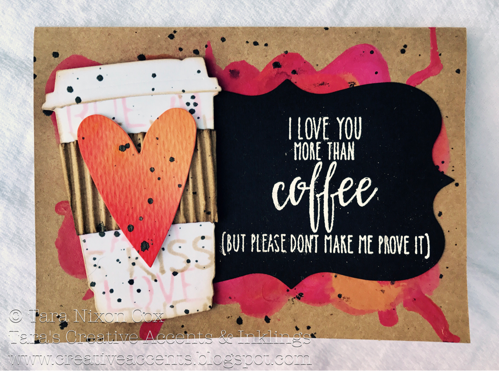
Today I’m sharing the card I made for my Valentine, my husband, Brian. As you can see from the sentiment (by Hampton Art Stamps) I love him more than coffee (that’s a whole lot *wink*).
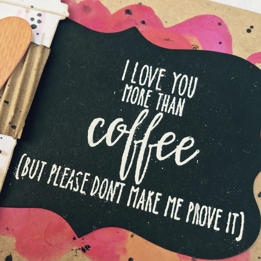
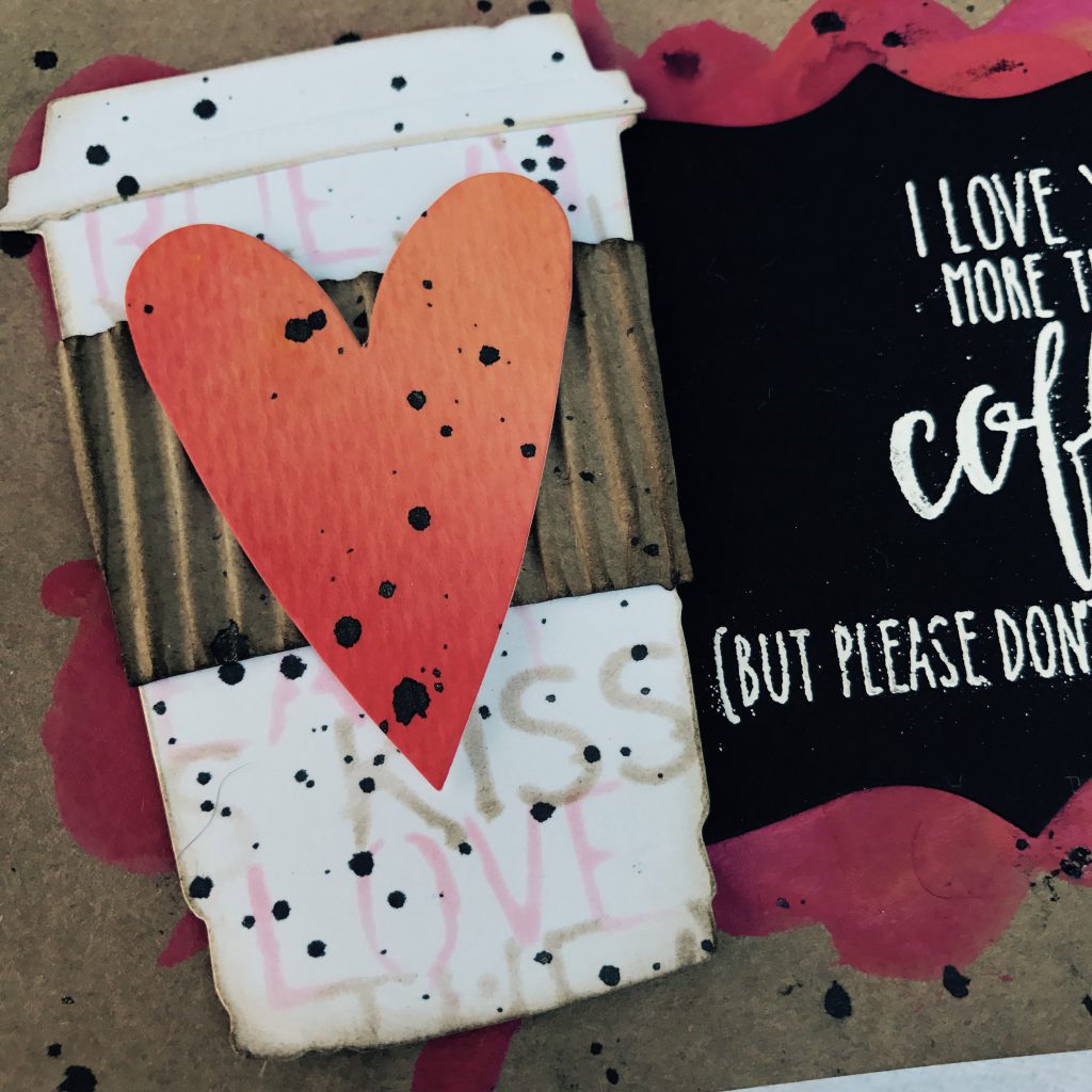
I paired this fab sentiment, which I white embossed on a black die cut label, with a coffee cup die cut by Tim Holtz, which I inked up with a stencil & Distress Ink (offset in two colors to fill in the space) and finished with a corrugated sleeve & watercolor heart (a cutout left from a previous project). Black paint splatter tied everything together for me!
 I must confess, I wanted a fun & colorful background for my die cut pieces and was dreaming about the Distress Oxide inks that are coming out soon… have you seen how they look on kraft cardstock? Sigh. They are definitely on my wish list! But since they are still on pre-order, I realized I had another option for a colorful background on kraft and pulled out my Distress Paints.
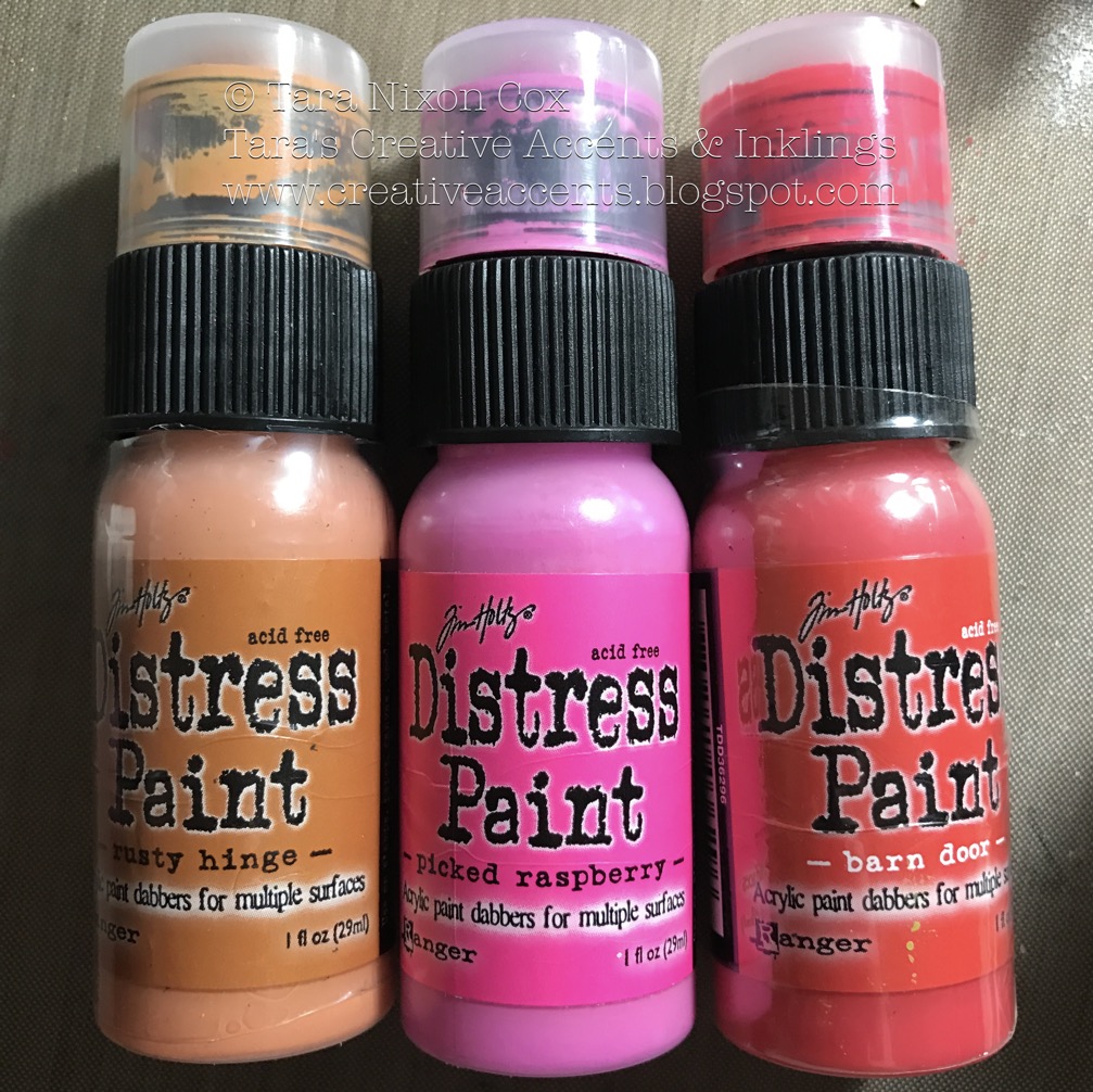
After dabbing some color onto the card front, I misted it with water to blend colors and add some fun drippy details. I alternated drying with my heat tool and adding more paint and water until I was happy with the blended background. I set this aside to dry under some weight (sizzix bigz dies did the trick!) to make sure my card was flat before adhering my layers. Hope you like it!
Inky hugs,
Tara

My favourite as the colour combinations are so unique and using them on Kraft cardstock (and a real sleeve too!) offers great texture and warmth. I would have never thought to use Distress paint on kraft….it’s the one product in their lineup I am least familiar with. Just beautiful!
Great card Valentine’s Day card lucky hubby. The coloring in the background looks like a covered up coffee spill and the black specks of paint all over the card gives it an “oops” touch. I really like the composition of this card. Thank you for your techniques.