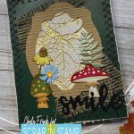
Fall Foliage with Tim Holtz
Happy Saturday Friends!
Well, there must have been a glitch in the Matrix as we seem to have the word Fall show up twice for our Random Act of Cardness Challenge this month. That’s okay! Who doesn’t like a little extra inspiration? Especially when it involves Tim Holtz!
Today I am using the Foliage 3D Embossing Folder and the Funky Foliage Thinlit Dies by Sizzix and Tim Holtz. These two products are perfect for fall themed cards.
If you would rather watch the video then read about the process you can click HERE
Now I must admit I had a general idea of what I wanted this card to look like and it didn’t come out exactly the way I wanted it, but that’s okay. We aren’t always going to love every thing we create and I have learned to just enjoy the process with this one.
I started by taking the 3D embossing folder and apply Versamark Watermark Ink onto one side of the folder. I then place a piece of 120lb white cardstock inside and ran it through my Gemini Jr.
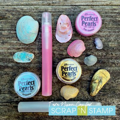
Next, I applied Sunflower Sparkle Perfect Pearls to the side with the Versamark. This really helps to bring out the dimension in the embossed piece.
I then die cut a frame using my Silhouette machine, but you can use a frame die if you have one. I adhered that frame onto a part of the embossed cardstock that I liked and then fussy cut around the frame. You can save the left over pieces to add to another card. I also die cut the two mushrooms, sunflower, fern sprig and little floral and adhered them together with some Art Glitter Glue. I also added some Vintage Photo Distress Ink to the edges to add dimension to the die cuts.
I have recently been challenging myself to add more layers and different textures and mediums to my cards. I pulled out my burlap and will some to my card. I pulled out some chalkboard cardstock in a hunter green colour and will use that to adhere all the elements on. Before I do that I want to distress the edge with a paper distresser. You don’t have to do this step, I just thought it would add more texture to the card.
To add even more interest I decided to use a decorative stitch with my sewing machine around the edge of the card. I can now adhere the panel down to an A2 side folding card base.
The last step is to add a sentiment and I pulled out some of my word dies and thought “Smile” suited this card the best.
I love everything that is going on with this card, but there is something that it is missing and I can’t put my finger on it….perhaps you guys can let me know what you would add or do differently with it.
Well, that’s it for me for today. I hope that you are inspired to create some fall cards of your own!
Take care and stay crafty!
~Chala
Fall Foliage with Tim Holtz Read More »