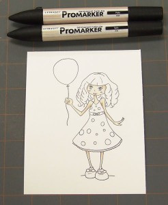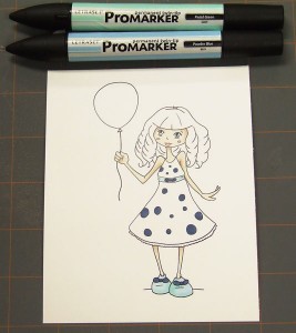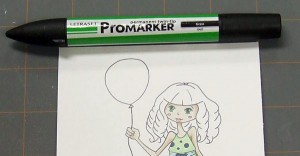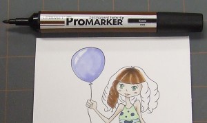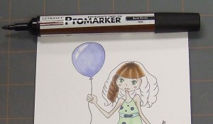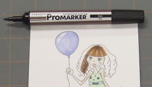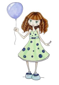
Hi everyone, Mara here. I’m really excited about joining you today to show you how to use Letrast ProMarkers to color Tori, one of our Paper Plums Digital Stamps. This is an original design by Christine Eberle, isn’t she adorable!?
I’m going to take you through coloring this picture step by step with lots of pictures and detailed descriptions to show you how to get the best results. We’ll go over blending to create soft shadows, adding small details and last but not least creating amazing looking hair! Every woman wants amazing looking hair! Right?
Okay, let’s get the show on the road! (Note: I used the fine tip on the markers for most things because the areas being colored were small and when I changed to the chisel tip I noted that in the instructions.)
If you need to see more detail on any of the pictures just click on them for a larger view.

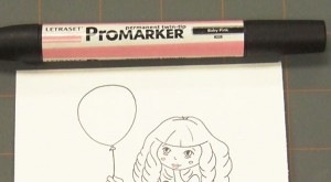
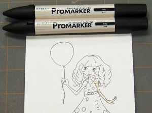
Step 1: Using Baby Pink
Color in the lips and cheeks very carefully. Doing this first and letting the marker dry helps to prevent these small details from bleeding and getting lost.
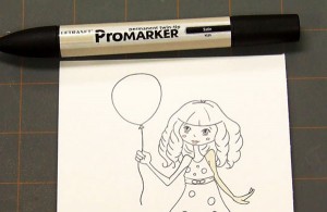
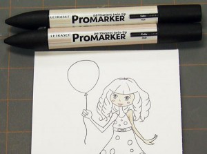
 Step 2: Using Satin
Using strokes that run the length of the arm, from shoulder to finger tips so it looks smooth, I color one arm at a time.
Mara’s Tips&Tricks!
I prefer working on one small area at a time because markers dry quickly and to create soft shading you need to work while the marker is still wet. If you color in all the skin at once you will not be able to achieve the soft shadow look as easily.
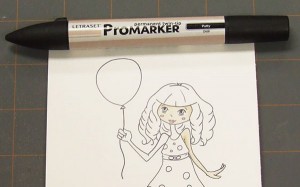
 Step 3: Using Putty and Satin
Quickly color with Putty on the under side of the arm. Use the Satin again to colour along the line where the Putty and the first layer of Putty meet. This creates a soft shadow.
 Step 4: Using Satin and Putty
After coloring the face with satin, go back to the arm and add in a little bit of Putty in the arm pit area to create an even darker area.
Mara’s Tips&Tricks!
Markers can be layerd three times to give you a darker shade than the previous one but you need to let them dry just a little so that the paper doesn’t get over saturated and bleed past the outline. You can usually do two coats (a lighter and then a darker color as the shadow) before the paper needs to dry a little. As a rule of thumb I use the time it takes to color another area (as long as they are not touching) before going back to add in the dark areas. In the example above I used the time it takes to color the face as my timer before going in to add the really dark area in the arm.

Step 5: Using Putty
Add shading with Putty around the sides of the face and under the bangs. Wait a few moments or use this time to color the next arm before going back with the Putty just along the very edge of the hair to create an even darker area.

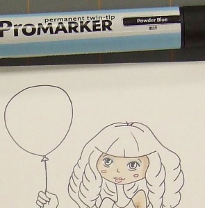
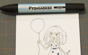
Step 6: Using Powder Blue
Once the flesh tone has fully dried on the face add in a light touch of eye shadow along the top line of her eyes.
Mara’s Tips&Tricks!
If the colors are wet they will blend and bleed together. If they are dry they will create a crisp hard line. In areas that you don’t want the colour to bleed (like lips or eye shadow) you want to be sure to wait until the markers dry. The reason for doing the eye shadow after you do the skin tone is because the eye shadow will look more intense if you don’t have the layers of skin on top. Think of coloring with markers like having strips of sheer ribbon that you are layering. If you have an ivory ribbon over a blue one it looks different then having the blue over the ivory.
 Step 7: Using Satin and Putty
Repeat the steps above to color the rest of the skin with Satin and Putty.

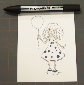
Step 8: Using Midnight Blue
Color in the small dots and bows on the dress and shoes. Doing this now will help prevent these details from bleeding later. This step is especially important if you decide to have a dark colored dress with light colored details.
 Step 9: Using Powder Blue
Color in the sash.
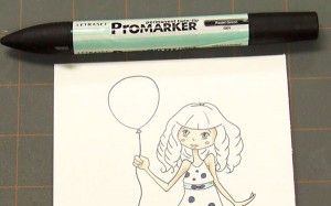
 Step 10: Using Pastel Green
Add shadows around the edge of the sash with Pastel Green. this gives the sash a lovey two tone effect.
 Step 11: Using Powder Blue and Pastel Green
Color the shoes in the same manner as the sash using the Pastel Green along the inside edge and bottom of each shoe.
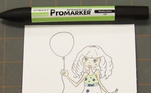
 Step 12: Using Meadow Green
Color the top of the dress using downward strokes avoiding the dots.
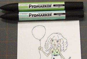
 Step 13: Using Pastel Green and Meadow Green
Add shading with the Pastel Green along the sash and at the shoulders. Because the Pastel Green isn’t very dark I went back over the same area that I put the Pastel Green with the Meadow Green color to make it darker.
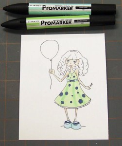
 Step 14: Using Meadow Green and Pastel Green
Repeat the same process as for the top of the dress. Work quickly with the Meadow Green (you may even want to use the broad tip but you have to be very careful with the dots) and while still wet add triangular shaped dark areas with the Pastel Green to create a soft drape like effect in the dress. I went over the Pastel Green area with the Meadow Green again making sure to go a little beyond the edge onto the rest of the Meadow Green to help it blend nicely and be darker.
 Step 15: Using Grass
Color in the eyes leaving white spots to create shines in the eyes.
Mara’s Tips&Tricks!
Sometimes it’s very hard to leave that white space but you still want the shine. No worries there are ways around it! When the maker is dry you can go back in with a white Gel Pen or a very fine White Out Pen and add the shine in.
 Step 16: Using Bluebell
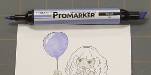
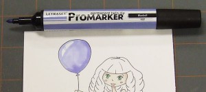
OK this is a tricky one but if you pull if off you will bet the lovely soft balloon look with a natural color variation. So here we go, uncap both ends of your marker. Start at the bottom of the balloon going along the left side with the fine tip to about the top of the balloon. Now come back leaving a white space (grin shaped) for the shine. Once the line meets your first line jump to about the middle of the “grin” and color a line in the middle of it to split it and make it look more natural. Flip the marker around and using the chisel tip finish coloring the balloon. Try not to use a back and forth movement, try to just use broad strokes at a constant speed to cover the balloon going over each area only once. If you do this you will have a natural color variation in the marker.
Mara’s Tips&Tricks!
Sometimes you want to try something new or you’re not sure how to go about coloring something. I always do a rest run on a scrap of paper, you don’t even need to use an exact print out you can just quickly trace the lines with a pencil it doesn’t need to be perfect remember you are just testing. Using tests on the side will help you achieve the best image that you are most happy with.
 Step 17: Using Bluebell
Wait for the balloon to dry a little and go over the right hand edge and the bottom of the balloon with the same color to create a shadow area.
 Step 18: Drum Roll Please! The hair.
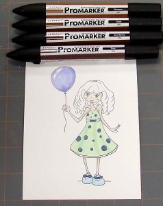
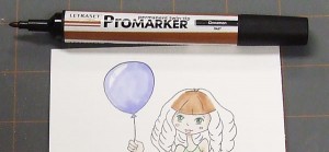
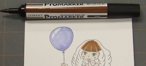
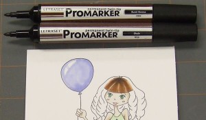
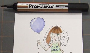
The hair! Now don’t be intimidated, and don’t get frustrated. I learned how to do this on my own too just from reading tutorials so all it takes is lots of practice and yours will look like mine in no time. I used 4 different colors in this order and always coloring less area then the last time. Cinnamon will be the very base color and will serve as the highlights on the hair. Cocoa is the color the hair will be. Burnt Sienna will be your shadows and Shale will be your darkest dark and will be used quite sparingly. To start with I uncap all the fine tip ends of the four markers. Markers dry quick and you need to be able to just grab the next color and go without having to fiddle with the cap. The amount of time it will take to color all the hair is not going to damage or dry your markers. I also like to set my colors on the desk in the order I will use them and create a little carrosel for myself. When I finish with one color I set it at the back and pick up the one at the front of the set. This usually insures me that I don’t pick up the wrong marker in the spur of the moment and that I don’t mess up. The next thing you will notice is that I work on one section of hair at a time and never on sections that are touching. If you do this the sections will not bleed into each other and you will have nice crisp highlights where you want them.
 Step 19: Using Cinnamon
Using strokes in the natural direction of the hair growth color from the top of the bangs to the bottom.
 Step 20: Using Cocoa
Add Cocoa except along the outer edge and beside the bang lines to great highlights.
 Step 21: Using Burnt Sienna and Shale
Create a dark area at the top of the bangs with short strokes using Burnt Sienna and then even shorter strokes of Shale. The Shale gives a very subtle effect and you may need to wait a moment before coloring with it so the paper doesn’t become over saturated and you lose the point of the forth color.
 Step 22: Using Cinnamon
Color a lock with Cinnamon. You don’t need to worry about which way your strokes go as it will be mostly covered.
 Step 23: Using Cocoa
Add Cocoa leaving lighter areas as shown along the curve lines.

Step 24: Using Burnt Sienna
Add Burnt Sienna along the middle area of the Cocoa as shown above.

Step 25: Using Shale
Create extra depth using just small strokes of Shale in the middle of the Burnt Sienna.
 Step 26: Using Cinnimon, Cocoa, Burnt Sienna, and Shale.
Repeat steps 21 to 24 for each lock of hair remembering to jump from side to side of the head to prevent the colors from one lock of hair to bleed into the next. And just like that, you are all done! You have created beautiful, gorgeous hair.
Thank you so much for sticking with me to the end of the tutorial. I hope you enjoyed it and find it useful! I know some of the coloring techniques are harder than others but all it takes is patience and practice. If you are having a hard time try a few attempts with a bigger picture, maybe even bigger than you can use on a card. Although you don’t get the fun of finishing a card if they are that big it will be much easier to learn the techniques if you are not restrained by the size.
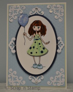
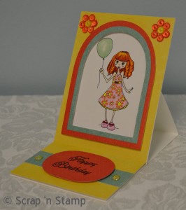
And here’s another card that Kate made with Tori that Christine colored as a strawberry blonde hair. Just a few changes and you get a totally different look!

Be sure to drop by Wednesday to meet Fynn and Mara will have more awesome marker tips for you.
PS We’d love to hear what you think about the new digis & colorables so leave a comment for us and we’ll enter your name in a draw to win the digi or colorable of your choice. Let us know what your favorites are or just leave some love for the designers – either way you might be the lucky entry and win a freebie.


