Scratch-N-Stamp
Search

Checkout

Keep up with Sales, New Products and other events at Scrap `n Stamp. Sign up for our newsletter now!

What's New

Hot Deals


Picket Fence Studios

What a Difference Paper Makes!

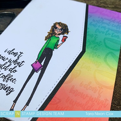
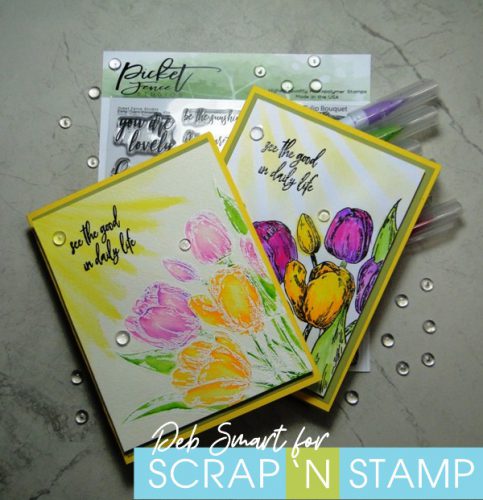
Happy Friday, my friend! It’s Deb here, for the Design Team. I hope that wherever you are, you’re looking forward to a nice weekend.  If you’re following along with the Scrap ‘N Stamp Random Acts of Cardness, today’s theme is ‘Sunshine’. So I’ve incorporated bright colours and sun rays in my project! Today I’m sharing two cards with you, both made using the exact same stamp set and markers. The difference is the papers I used – and what a difference paper makes! Here’s a look at both cards, side by side.

What a Difference Paper Makes!

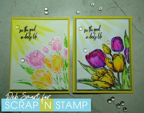
If I hand’t already told you that they were coloured with the same markers, would you believe me just by looking at the photo above? It’s true! The exact same colours in the exact same markers were used. However, the card on the left is done on watercolour paper. The card on the right is done on  regular smooth white cardstock.
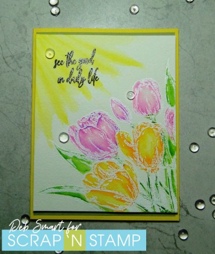
WATERCOLOUR CARD

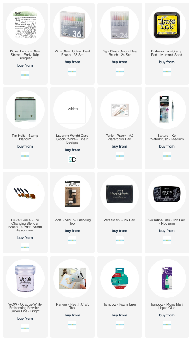
To start, set up the watercolour paper in your stamp platform. Because of the texture of the paper, you’ll want to ink & stamp twice, for a complete image. Ink up the Picket Fence Studios Early Tulip Bouquet image stamp in Versamark ink. Ink & stamp twice, and then cover with fine white embossing powder. Use a heat tool, to set the powder.

Now, use Zig Clean Color Real Brush Markers and a water brush to colour the tulips, stems and leaves. Next, use the yellow marker to create some sun rays, and blend them out with the water brush.  Once the panel is dry, stamp the sentiment from the same PFS Early Tulip Bouquet set in the upper left corner, in Nocturne ink.
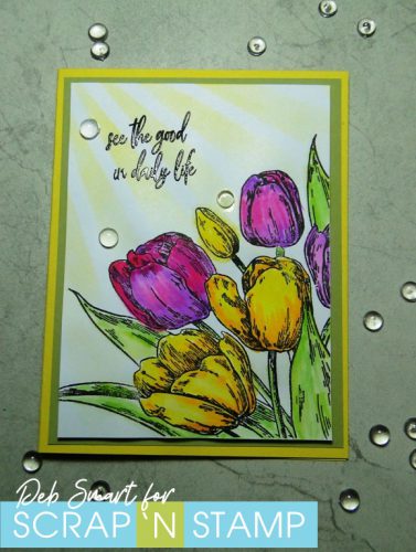
What a Difference Paper Makes!

REGULAR CARDSTOCK

For the card on regular cardstock, swap out the watercolour paper, and stamp the image in Nocturne ink on regular smooth white cardstock. Use the same Zig Clean Color Real Brush Markers and a water brush to colour the images.

The marker colours I used for both cards are: 050 Yellow, 052 Bright Yellow, 025 Pink, 081 Light Violet, 041 Light Green and 045 Pale Green.  This time, use a stencil to create the sun rays. Apply Mustard Seed distress Oxide with a blending brush through the stencil. Then, again stamp the sentiment in Nocturne ink.

Finish both cards by layering onto a piece of light green cardstock, and then a light yellow card base. A few clear drops are added for embellishment.

What a Difference Paper Makes

Quite a difference in the intensity of colours, don’t you think?!  Even if I had embossed the image in white for the 2nd card, that wouldn’t have changed the intensity of the marker ink. Plus, with regular cardstock, you can’t add as much water for blending, for fear of completely breaking down the card fibers.

WHICH DO YOU PREFER?

It’s amazing what a difference paper makes, isn’t it? Do  you have a preference? The soft look of watercolour, or the intense full colour of regular cardstock? I think both are beautiful, in their own way. So as you can see, if you want to ‘mix things up’ with your artwork, just try switching up the substrate you’re working on! Or use the same substrate (base), and change the medium. Or change both! Wouldn’t these tulips look beautiful in alcohol inks? How about Perfect Pearls?

Before you head off to start creating, just a reminder that there’s still time to visit & leave your comments on our May Blog Hop! CLICK HERE to start with Tara’s post, and leave a comment on each blog as you hop along. By doing this, you’re automatically entered into the draw for a $50 Gift Certificate to Scrap ‘N Stamp! But hurry – it closes on May 14th!   Also, join our Random Acts of Cardness challenge on the Facebook Challenge Page HERE. At the end of the month, one lucky winner will be randomly chosen from all the submissions for another $50 Gift Certificate!  That’s a lot of shopping you could win 🙂

Thanks for hanging out with me today! I hope you’re inspired to create.  Please leave me a comment, and let me know what you think of these 2 versions of the same sunshine tulip card.

What a Difference Paper Makes!

Affiliate links are used, at no cost to you. When you use my affiliate links, you help support me to purchase new products, & maintain this blog. Then I can continue sharing new projects with you!


What a Difference Paper Makes! Read More »

Picket Fence Studios Foiled Christmas Cards

Hi crafty friends and welcome back. Sandi MacIver here and I have a super fun post for you today. I was playing with the Gemini Foil Press Machine and I made two Picket Fence Studios Foiled Christmas Cards to share with you in today’s Stamping Video.

Picket Fence Studios Foiled Christmas Cards

I used the Picket Fence Studios Two Part Foiling & Cutting Dies for both cards. The Falalalaaaa sentiment, the Merry Christmas sentiment and the Christmas Leaf Bulb. What I love about these sets is there are two dies. One to foil with, and a second outline die to die cut the image out allowing you the freedom to place it wherever you wish on your card.

With the Christmas Leaf Bulb I show you how to use the positive and the negative of the foil, to create two Christmas balls from one piece of foil.

Picket Fence Studios Foiled Christmas Cards

For the pink card, I use Distress Oxide inks in Picked Raspberry and Worn Lipstick to sponge onto the white card stock before I do the foiling. That’s what creates the pretty two tone background effect.

Picket Fence Studios Foiled Christmas Cards

The Christmas Ball on the blue card is the one created with the negative foil piece left over from the first pass, that’s why most of the ball is gold and just a tiny bit of the blue card stock shows through. Because of that, I chose to sponge the card front for this one to add a little depth of color to the background.

Here’s the video for the Picket Fence Studios Foiled Christmas Cards walking you through the steps to sponge, foil and put the cards together.

https://www.youtube.com/watch?v=GYzLMtUuves

Thanks so much for stopping in today and I hope you enjoyed the projects. I have listed the products I used below with links to the Scrap ‘N Stamp Store for you.

Until next time, Happy Stamping

Picket Fence Studios Foiled Christmas Cards Read More »

Tuesday with Tara {take 216} Without Coffee

Happy Tuesday!

Happy Tuesday with Tara! Today is the day a lot of kids & teachers are officially back in the swing of things with a new school year! I thought some more rainbows & coffee would be in order to help you get through the day! I’m sharing another fun rainbow card with the Coffee Understands stamp set by Picket Fence Studios, this one questions what we would do without coffee. As you can see by the sentiment, it’s probably best that we don’t find out the answer! ha!

Coffee Understands by Picket Fence Studios: Without Coffee

Simple Design.

There is something about this stamp image that makes me want to keep my card fairly simple. I love how long & lean she is (total opposite of me!). It looks like she’s got her priorities straight, coffee in one hand, ready to take on the world (or a classroom, at least)!

Bold & Colorful.

Just because a card is simple does not mean it can’t be bold & colorful! I paired bold black & white with a colorful rainbow panel I inked up with a variety of Distress Oxide Inks. The colors blend together so nicely and it ends up looking like I used a wider variety of colors than I actually did! Curiosity got me wondering what would happen if I stamped with a watermark ink pad over my inked rainbow… and I was pleased with how it came out! (I used Versamark, but I’m guessing this Gina K Embossing & Watermark Ink would work just as well!)

Coffee Understands by Picket Fence Studios: Distress Oxide Rainbow

Details.

As I mentioned earlier, I tried to keep this card pretty simple. The stitched details from the edge die (by MFT) are repeated on the white card front and the black strip beside it. I stamped with bold black ink and repeated the sentiment in watermark on the rainbow panel. A single cup design from the stamp set was also repeated to fill in the gaps. Then I chose a few colors from the rainbow to brighten up my stamped image. Repeating details like the stamp images and colors kept the design feeling simple.

I hope you like my happy rainbow, and that you have no reason to find out what your day, week or year will be like without coffee!

Inky hugs,

Tara

Tuesday with Tara {take 216} Without Coffee Read More »

Free Shipping Anywhere In Canada