Scratch-N-Stamp
Search

Checkout

Keep up with Sales, New Products and other events at Scrap `n Stamp. Sign up for our newsletter now!

What's New

Hot Deals


ps.iloveyou.bychala

Blooms Fill In – Concord & 9th

Hey there and happy Saturday! It’s Chala and I am back for another “Floral Frenzy” themed card.

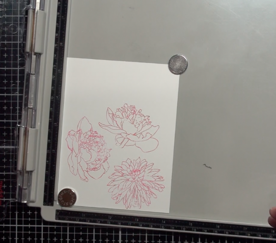
I am going to be using the Concord & 9th Blooms Fill-in stamps. This is an older set but it is one of my favourite floral stamp sets. There are so many different themes you can use this stamp for: Birthday, Mother’s Day, Thank-you, Christmas, Wedding, etc. There are also coordinating dies, however, I will just be using the stamps today for which I created three cards.

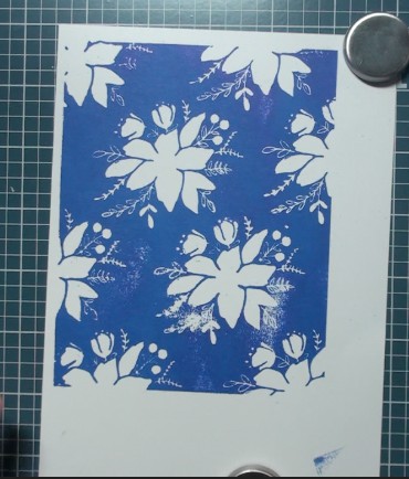
For the first card I used Blue Print Sketch Distress Ink and my Tonic Travel Stamp Platform to create the background with the largest of the stamps. I highly recommend using some type of stamp platform as you will need to stamp this background multiple times to get a good coverage and you will need to apply a bit of “CPR” type pressure. This large stamp measures just a bit larger than a standard A2 size card.

The next step is layering on the flower and leaves. I am able to do this with an acrylic block along with the help of my Wendy Vecchi Make Art Stay-tion. The metal platform and the large magnets keeps everything in place so your project does not shift or accidentally disappear from your work surface. (It is also great if you are in the midst of a hot flash and need to have a fan on, or if you have small children and/or fur-babies who like to hover while you work….)

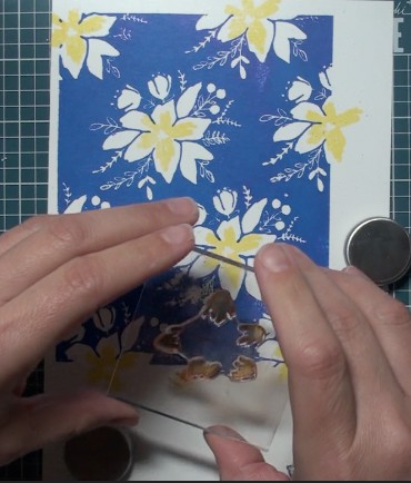
The Distress Inks I used for the flowers and leaves are as follows: Squeezed Lemonade, Wild Honey, Ripe Persimmon, Peeled Paint, Shabby Shutters, Antique Linen and Weathered Wood. I do drop my stamp and get ink where I do not want it…but that is okay! I used the Tombow Mono Sand Eraser and it removes that ink blotch just fine!

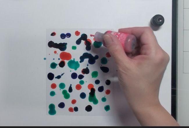
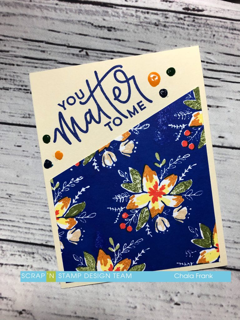
I cut the panel in half on an angle and trimmed of an 1/8″ of each side. This will allow me to create two cards. I adhere one of the pieces onto a piece of cards stock that was complimentary to the colours of ink used. The sentiment is from the same set and I used the “You Matter to Me” phrase. This was stamped with the Blue Print Sketch Distress Ink. To finish off this card I added some Nuvo Drops in the following colours. Midnight Blue, Woodland Green, English Mustard. Disclaimer: I need to practice using mine more! I admittedly have not used these particular colours and I should have shaken them and tested them on a piece of paper prior to applying them…..So they are a bit gloppy. I will likely remove them with a craft knife and try again! 😬 I wanted to show you the original as it is important to know we all make mistakes!

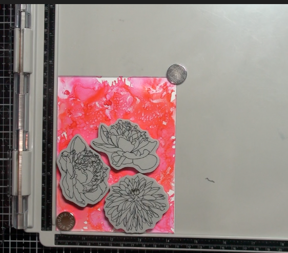
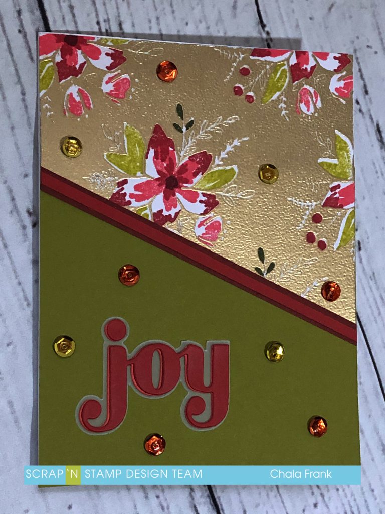
I really like that this stamp can have a Spring/Summer look as well as a Christmas look. So, the next card I created I followed the same steps, however, this time I created the background by stamping in Versamark Ink and Gold embossing powder. I then stamped the flowers and leaves in the following Distress Inks: Abandoned Coral, Fired Brick, Crushed Olive, Forest Moss and Aged Mahogany. I again cut the panel on an angle so that I could create an additional card. I adhered a piece of cardstock similar to the crushed olive colour to my card base and then adhered the stamped panel. I used two thin strips of cardstock over top of where the two pieces joined. I then used the Birch Press Designs – Joy – Sugar Script Die for the sentiment. This die is a beautiful script font and it gives you the shadow layer to go behind it.  I die cut two of the script dies from two different colours and layered them together to give more interest to the card. Finally, I added some sequins to give the card a bit of sparkle.

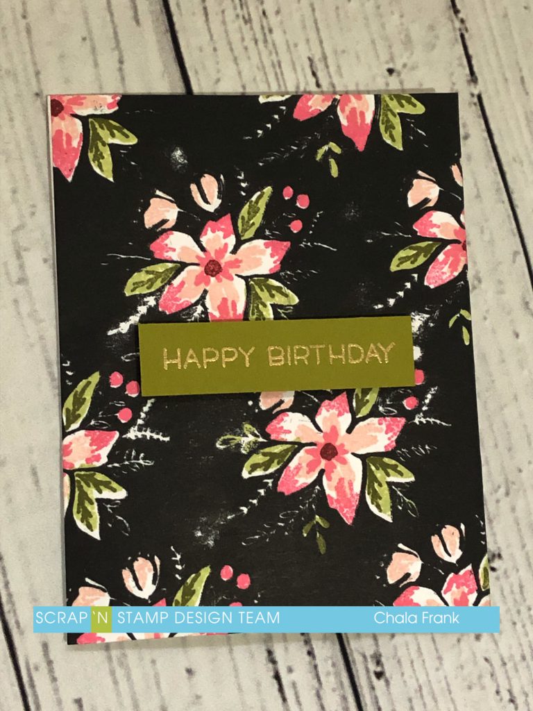
The third and final card is more of a summer look. I kept the panel whole this time. Stamping the background in Versafine Black Ink and the following Distress Inks for the flowers and leaves: Tattered Rose, Worn Lipstick, Shabby Shutters, Forest Moss andAged Mahogany. I used the same green cardstock as before to create a sentiment banner and stamped “Happy Birthday” from the Lawn Fawn – Hay There stamp set with Versamark ink and gold embossing pohttps://www.scrapnstamp.ca/store/pc/Lawn-Fawn-Embossing-Powder-Gold-825p22850.htm?idaffiliate=24wder.

Thank you for stopping by and I hope you enjoyed today’s cards.

You can watch the quick video of how the first two cards came together here:

https://youtu.be/nvCZ9UiOV58

Share a photo of your Floral Frenzy card on the Scrap’N Stamp Challenge Facebook wall and get your name entered to win a $50 gift certificate to Scrap’n Stamp! You’ve got until May 31st to post. Make sure to hashtag it for another chance to win #SNSfloralfrenzy.

Stay Crafty Friends!

~Chala

Blooms Fill In – Concord & 9th Read More »

Lawn Fawn Interactive Easter Card

Hey Guys!  Chala here for today’s blog post.

Today I am using a bunch of Lawn Fawn products to create this fun little Easter card.

I am using the following stamps and dies from Lawn Fawn:

Stitched Hillside Boards, Meadow Borders (however you can also use the Grassy Hillside Borders or Simple Grassy Hillsides), Easter Party and the Let’s Toast Pull Tab die set.

I stamped out the images and coloured them with my comic markers then I layed out the elements I wanted to have in my card.

Now, this is not the exact way the card ended up…but it gave me an idea of where I wanted everything to be.

I use two different shades of green cardstock to die cut the hills this helps to add some visual interest to the card and the illusion that one hill is much closer than the other.   I also cut out some of the tulips from yellow and pink cardstock and the butterfly from some light blue cardstock.

I set these pieces aside and work on the sky background.  I use the amazing Picket Fence Blender Brushes and the Cloud stencil from My Favorite Things and Distress inks in Tumbled Glass and Broken China.  I create the clouds by alternating these colours and turning the stencil to give a layered cloud look.

The next step is to die cut the track of the slider portion….I seemed to have misplaced this part of my die set…😬….so, I ended up using one from the Slide on Over set from Lawn Fawn….  I cut the track in both the background cloud panel as well as the larger background hill.

I then adhere the larger background hill to the cloud panel ensuring the panel’s line up.  I insert the slider mechanism and adhere the little critter with some Scor Tape.  I decided I wanted the cute little bunny character to pop up from behind the grass instead of the little flower girl.

Now I add some foam tape to the grassy cardstock that I die cut earlier.  Making sure that it lines up on either side of the slider mechanism and doesn’t interfere with how the slider moves up and down.

Next I can add the other little critters to the front as well as the tulips and butterfly with some glossy accents.

I trimmed off the excess overhang from the grass and the pull mechanism, die cut the notch, added the decorative pull and stamped “pull here”.  I add some more foam tape to the back of and on either side of the slider mechanism and adhere it onto my card base.

My last step is to add the sentiment.  I did this by stamping the Happy Easter sentiment onto some purple cardstock with Versamark and heat embossed with white embossing powder and popped it up with foam tape.

I felt the sentiment lacked something…so I added some stitch lines with white gel pen and clear Wink of Stella to the petals on the little girl.  Here’s the finished card.

Due to some technical difficulties there is no video today.  Sorry about that guys!

Be sure to stop back here on Saturday to check out what Kia has in store for you!

Thanks so much from stopping by and I hope the Easter bunny is good to you all!

~Chala

Lawn Fawn Interactive Easter Card Read More »

Alcohol Ink and Acetate Backgrounds

Hi Again, Chala here for today’s blog!

I was looking around my craft area and realized I have a lot of craft supplies that I have not even used yet!  Something new will come out and I just HAVE to have it….but, sometimes the chaos of my life takes over and these supplies will sit for weeks, months and sadly even years before I get a chance to play with them.  That is how I feel about my alcohol inks.  I have used them a bit, but not nearly enough!  So, I decided to pull them out along with some acetate and a few stamps and dies that I have purchased but have not yet used.  Some of the dies have been sitting so long I don’t even know how, when or where I got them from!  But I am glad I am using them now!

To start, I gather all of my alcohol inks.  The colours I currently have are Patina, Pool, Aquamarine, Amethyst, Coral and Flamingo.  (However, I have also seen the new Pearl Alcohol Inks and I think I might need to purchase some of those!!)  I also grab my Blending Solution and my Starbucks reusable straw to help mix the colours.

I have some acetate cut down to standard A2 size (5 1/2″ x 4 1/4″).  I start to drop colours onto the acetate.

I then add some of the blending solution to help move the colours around. I will pick up the paper and move it back and forth to get things flowing.   I also grab the straw and blow air to help move the ink in particular areas  (To see how each background was created I suggest you watch the YouTube video). I add more of the alcohol inks and blending solution as I go along until I get the look I like. This is not something you can necessarily “teach”.  I recommend you just play around until you get something that you like.  Each person will have their own preference of when to stop or keep going.  If you absolutely hate the result you can do one of two things.

1.  Set it aside!  Chances are once it dries you will like it.

2. You can use some rubbing alcohol and a paper towel and wipe it all off and start over!

 I suggest you try to set it aside first.  That is what I did with some of mine.  I will even show you in my YouTube video what I did with the ones that did not work out or I did not particularily like as a background.

I will make a few backgrounds using different colour combinations and blowing techniques with the straw.  I will also add silver and gold deco foil to a couple of them before they dry completely to add a little shimmer and shine!  Here is a close up of one of those backgrounds.

The picture just does not do it justice!  They turned out super cool!

From here there are SO many things you can do!  I begin trying out the Alcohol Lift Ink.  I tried using some detailed stamps and some with larger surface stamp areas.  I like to use the Tonic Stamp platform because you can turn the lid around to use with clear or cling rubber stamps.  I apply the Alcohol Lift Ink liberally onto the stamp, close the lid down onto the inked acetate and apply even pressure.  I then open the lid, slide out the acetate and re-stamp onto white cardstock.

Then I bring back the acetate and with a paper towel I dab up the excess alcohol ink and then buff the surface with a clean area of the towel.  The detailed stamp didn’t give me the results I had hoped for on the acetate… but the stamp with larger surface area turned out well.  Here is how that one looks.

I encourage you to take a look at the stamps you have and play around!  I even tried using a stencil and  lifting the ink with a foam ink blender and the Alcohol Blending solution.

The possibilities are absolutely endless!

I was also able to put some of my unused die cuts to good use!  I created some trifold cards (a Jennifer McGuire technique) as well  as some window cards to give a stained glass feel!  Here is how those cards turned out.

This first one is with silver deco foil and a trifold card.  I used one of my “not so good” backgrounds to stamp a sentiment on the inside using the Alcohol Lift Ink.

This second card I used the stencil background and a top folding A2 size card.  I sandwich the acetate between two pieces of cardstock so that when you lift the card it has a stained glass look/feel.  I left enough room at the bottom to adhere a die cut sentiment and this will also allow me a space to write on in the inside of the card and not be seen through the window.

The last one I am using is another background with deco foil, this time in gold.  These colours reminded me of Easter….and I had a die cut that reminded me of a Ukrainian Easter Egg design.  So, I pulled out an oval die set I had, some gold foil cardstock and made a card that used the window card and trifold card ideas together.  Again, I sandwich the acetate and the gold cardstock between the card base and the card panel.  I heat embossed a sentiment with gold embossing powder on a banner and popped it up with foam tape.  Here is how the last card turned out.

I kept these cards simple, but if you like you can add embellishments such as sequins and pearls.

I will save the other backgrounds and stamping that I did to create cards at another time.

I encourage you to watch the video below as it gives greater detail on this technique and the assembly of the cards.

https://youtu.be/IAhHIlwZZs8

Thanks for stopping by for today’s post!

Remember to check out all the amazing products and sales at the Scrap ‘N Stamp site!

Happy Crafting!

~ Chala

Alcohol Ink and Acetate Backgrounds Read More »

Free Shipping Anywhere In Canada