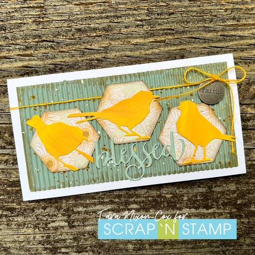
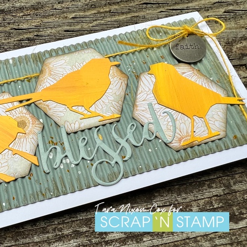
I used some of the leftover painted birds from my art journal page for the inspiration hop (which there is still plenty of time to participate in! See all the details & start here) as my starting point for this card, since I was going with paint as my inspiration word! I found this pretty daisy paper in a 6×8″ paper pad by Vicki Boutin and selected the rest of my color palette from there.
I decided to add texture with a layer of corrugated Cardstock on my card base, but since the color wasn’t quite right I added more paint- covering up most of it with Speckled Egg Distress Paint. I left a rough edge with dryer brushtrokes to add dimension and then splattered Cheddar & White gloss sprays across it.
The floral tiles are cut from Tim Holtz’s stacked hexagons, which I placed staggered across the panel. As finishing touches, I added some more yellow with twine to hang a word charm and a die cut word by Honeybee.
The birds were cut from a card stock panel I painted with a mix of lemon & cheddar Dina Wakley paints.
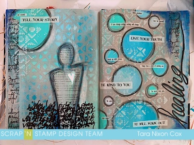
Happy Tuesday! Today I’m sharing an art journal spread I did while I was on vacation at the beach recently. I had packed a tote with my Dina Wakley paints & a few other supplies, along with my Media Journal, Scribble Sticks & some Collage Sayings, which ended up being a foundation for these pages.
Healing art journal spread featuring Dina Wakley Media
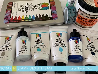
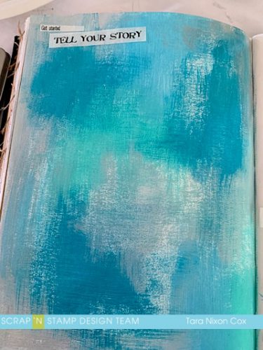
I was inspired by the many shades of blue when I looked at the ocean… it was stunning, so I chose to work almost completely with blues for these pages (I didn’t have ALL the Dina Wakley blues… but I’ve since ordered the ones I was missing! LOL.) You’ll see on these pages: Sky, Turquoise, Lapis & Night together with Elephant & Mineral). I also used some modeling paste I had packed (similar to this one by Ranger) Washi Tape & a Glue Stick. I neglected to pack gel/multi medium and white paint, so that challenged me a bit… but I managed to make it work.
When I started I just knew I wanted to work with blues… so I just started to randomly apply blue paint to a page, overlapping and blending colors as I went. I had some stencils with me, so thought I would lift color off the background with a baby wipe afterwards (I had a mixed blue background, painted over it with elephant, then placed the stencil on top while it was still slightly wet and lifted color through the stencil with a baby wipe). I selected some sayings from the collage tissue and decided I would work with those on my pages, so placed them (not glued them!) on the first phase of my background before continuing on. Here’s step one of the left page:
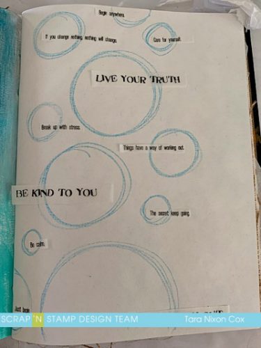
I decided to sketch out some rough circles for the facing page, filling them afterwards with different shades of blue. I then selected collage sentiments and sorted out a rough layout. I typically forget to snap progress photos when I work in my art journal (especially when it’s been so long since I’ve done it, as was the case this time!) but I wanted to remember where each piece fit, so a quick photo on my phone was a great reference tool 🙂
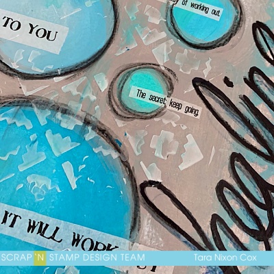
After filling in the circles, I painted around them with elephant to tie the pages together, then decided to add a circle to the left page to anchor the collage words I had chosen for that page. I added black outlines to my circles with a combination of Scribble Sticks and Stablio Water color pencil. I sketched my title ‘healing’ the same way, then went over it with a black alcohol marker to really make it pop. Details like washi tape and texture paste through the stencil were added to both pages.
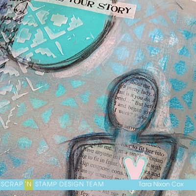
I also decided to try my hand at sketching out a loose figure similar to the ones Dina draws. Because I had no white paint, I cut some book print in roughly the same shape and glued it down inside my figure, adding some shading with Scribble Sticks.
I finished with some ‘scribbly journaling’ which overlaps so it’s more of a design element than being actually legible. I only had a chisel tip marker with me, so I’m not thrilled with my writing… as Dina says, “done is better than perfect” so I made it work. For me it was just a bit of therapy text about my journey of healing so far, since I was recently diagnosed with an auto-immune disease. You can visit my personal blog to see a closer look at each individual page of this spread if you’d like!
Hello and Happy Monday. I hope you all had a lovely weekend, filled with lots of crafty fun.
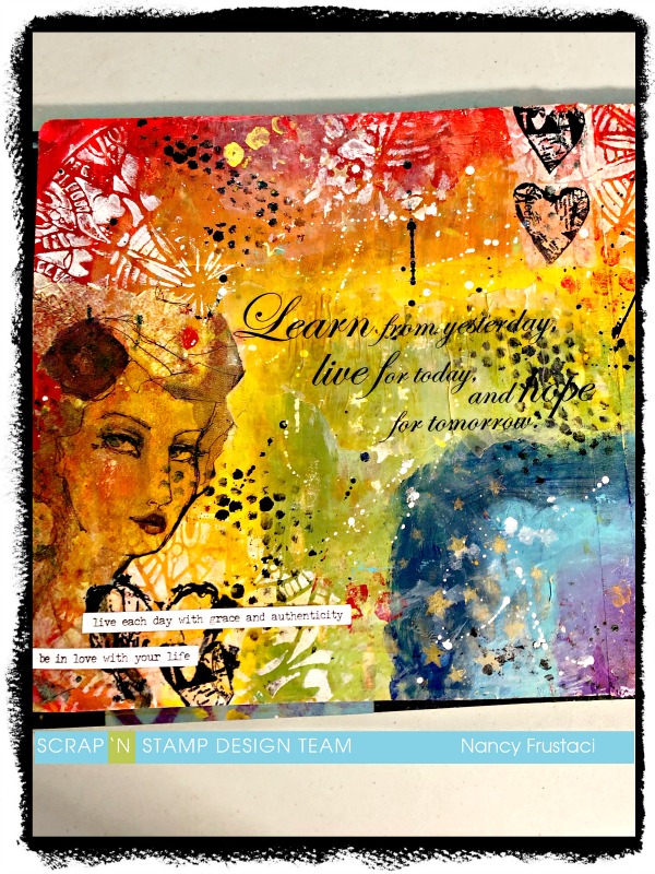
I am back on the blog with an art journaling layout. I have to admit it’s not exactly my favorite, there are parts I love and well, parts I wish I could redo. But I thought I would keep real with you all and share it anyway.
For this project I cracked open a new journal. I decided I would try out the black 8×8 Dylusions journal. I just wanted to do something a little different
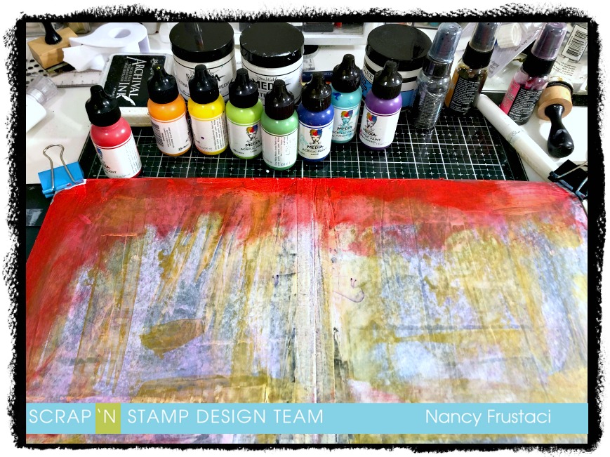
I started out by covering both pages with a light layer of white gesso to prime the pages. As you can see there was more than just the white gesso on the page, you can see the streaks of gold (Glint- Dina Wakley paint). Before I started the actual layout, I used the page as a place to apply my excess paint from another project onto.
I really had no plan for this, it just kind of came together (sort of) lol. I pulled out all my paint and let loose. I really felt like doing a rainbow, so that is what I did. I just went to town applying the paint with my fingers, rubbing it into the page, trying to blend the colours together ever so slightly without losing each of them.
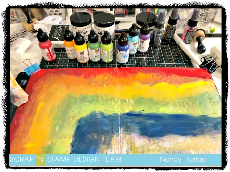
In between the layers of color, I would go in with a damp baby wipe and a Dylusions stencil to try and add a little texture, and slightly blend the colors together.
As you can see I did not get a great blend on the colours but I really like how vibrant everything stayed. If I could go back and rework this I totally would but I had to do this in stages in between caring for my twins, so needless to say things dried before I could get back to it. I decided to continue on and see what would come of the design.
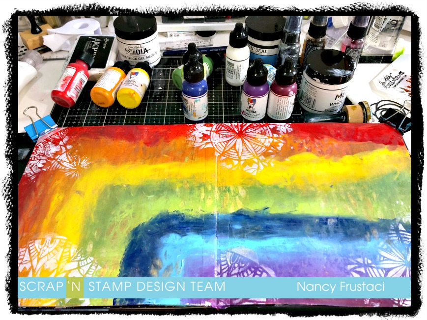
I pulled out a few stencils from my stash, which I have linked to below, and my Tim Holtz blending tool with a clean sponge and got right in there. The first stencil I used was the Spring Medallion from TCW and some white gesso and added this to the corners, top, and bottom of the page. Really just wherever I thought it would look good.
Once I was happy with the first set of stenciling, I rummaged through my stash to pull out things I thought would look good together. I stenciled in some stars and some texture, going in with white gesso, black paint and then the glint paint. Now that I had the stenciling where I wanted it, I watered down some of those same colours and splattered them onto the page. For the white I pulled out my Sharpie paint pen.
I set that aside to dry and then hummed and hawed over what I was going to do next. Rummaging through all my stash, staring at things for a long time, flipping through the collage collective several times, even going as far as ripping something out. I really was in a bit of a funk and was not sure how I was going to complete this page at all.
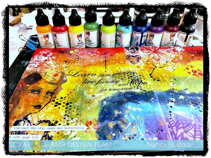
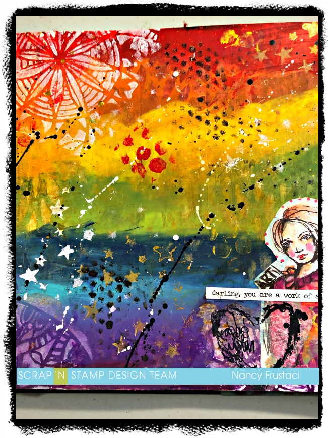
I pulled out some old vellum sentiments I had from my scrapbooking days, as well as some Jane Davenport napkins and decided to collage those onto the background. From there I felt something was still missing so I stamped out some of the hearts from the Collafewd hearts stamp set from Dina Wakley Media. I stamped them onto some collage paper using Archival Black ink and collaged them onto the page as well. I realized quickly that I did not add enough of the gel medium to the back of the collage paper and because of that, you can still see some of the tissue paper. To finish it off I added some sentiment or rather phrases sticker from a Tim Holtz collection.
In the end, I did use the collage collective, I just didn’t use what I had set my sights on at first. I trimmed out this girl and added her to the bottom corner of the second page. Once more adding the same collaged hearts just to tie it in together and adding a little sentiment, which I notice is not straight at all, so yeah not happy about that. Lol
I really hope you got some inspiration and enjoyed the crazy little journey I took you on. Its been a little nutty as of late and the page perfectly expresses my state right now, ie a little all over the place.