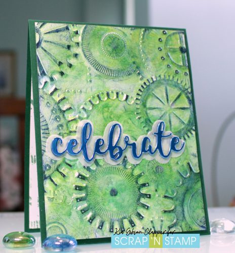
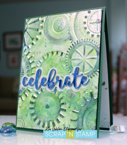
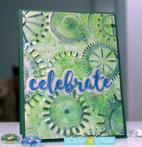
Celebrate is the keyword for the Random Act of Cardness events that was to be yesterday. But, life happens and internet happens, so we have “Celebrate” today.
I kept with the current month’s theme “For the Boys” for my card, again using the “Mechanics” embossing folder by Tim Holtz. This time I used alcohol inks and Ranger Archival inks to do my card. The details in this embossing folder make these techniques so easy for anyone to accomplish.
To start I am using glossy cardstock, along with Neenah cardstock for the inside and Gina K. Design for my cardbase. As the paper is glossy card I spritzed the back of the card before running it through my Gemini Jr. to ensure a good impression. And, I ran it through three (3) times.
I used three alcohol pearl inks, being Sublime and Tranquil, along with the Silver Mixative. Using my ink blending tool with felt I applied the ink to the felt, then transferred to the cardstock until I was happy with the appearance.
Once dry I added Ranger Archival ink in Cobalt and Black Soot to highlight details of the folder.
When dry I attached the panel to my card base using foam tape, which I find works best with these kind of embossing folders. If not using foam tape I would suggest using Scorpal tape.
I then die cut the “celebrate” from the blue mirror card and two (2) cut with Neenah card, gluing them together to stack. The white pieces I coloured with Copic markers so I would not have any “white”.
I also cut a piece from vellum for the shadow, which I glued to the card front using vellum tape, then attached the word “celebrate” using Nuvo adhesive.
For the inside I inked the embossing folder with distress ink, then spritzed and put down a piece of cardstock, rubbing the card to ensure a good transfer. It makes for an nice finish to the card.
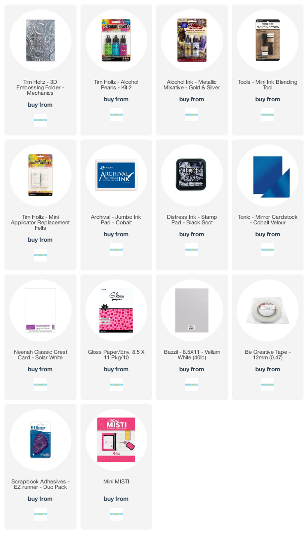
Thank you for joining me today. Following are Affiliate links for the products I have used for this technique, at no extra expense to you.
Hello and Happy Monday. I hope you all had a lovely weekend, filled with lots of crafty fun.
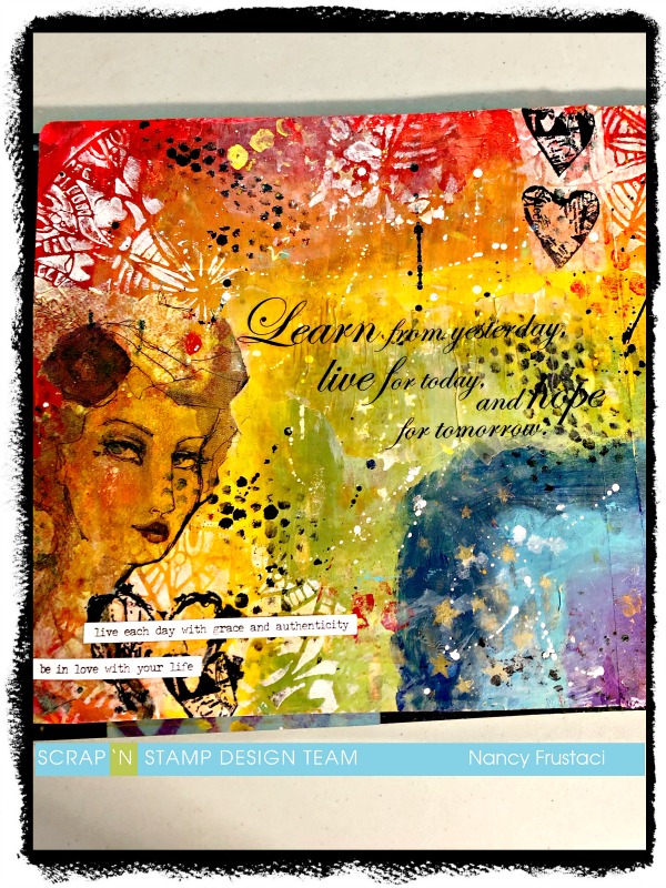
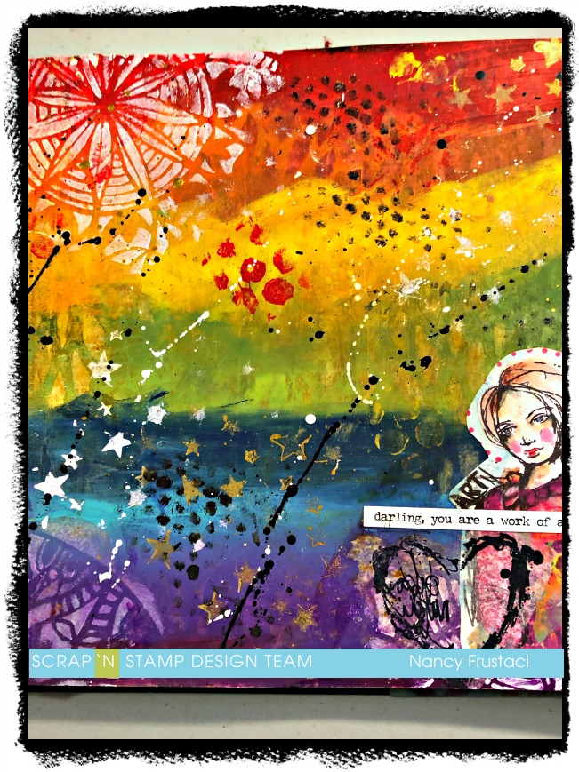
I am back on the blog with an art journaling layout. I have to admit it’s not exactly my favorite, there are parts I love and well, parts I wish I could redo. But I thought I would keep real with you all and share it anyway.
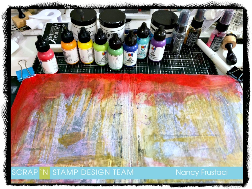
For this project I cracked open a new journal. I decided I would try out the black 8×8 Dylusions journal. I just wanted to do something a little different
I started out by covering both pages with a light layer of white gesso to prime the pages. As you can see there was more than just the white gesso on the page, you can see the streaks of gold (Glint- Dina Wakley paint). Before I started the actual layout, I used the page as a place to apply my excess paint from another project onto.
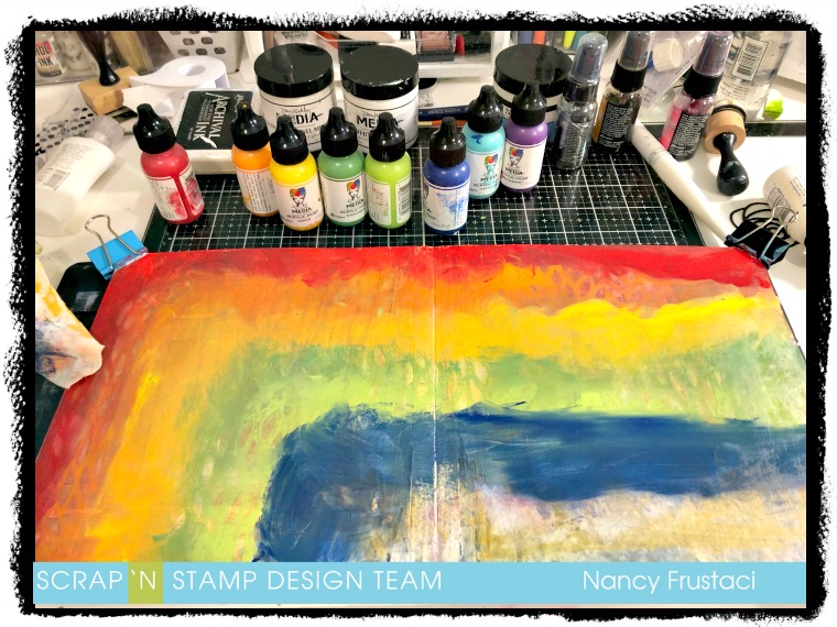
I really had no plan for this, it just kind of came together (sort of) lol. I pulled out all my paint and let loose. I really felt like doing a rainbow, so that is what I did. I just went to town applying the paint with my fingers, rubbing it into the page, trying to blend the colours together ever so slightly without losing each of them.
In between the layers of color, I would go in with a damp baby wipe and a Dylusions stencil to try and add a little texture, and slightly blend the colors together.
As you can see I did not get a great blend on the colours but I really like how vibrant everything stayed. If I could go back and rework this I totally would but I had to do this in stages in between caring for my twins, so needless to say things dried before I could get back to it. I decided to continue on and see what would come of the design.
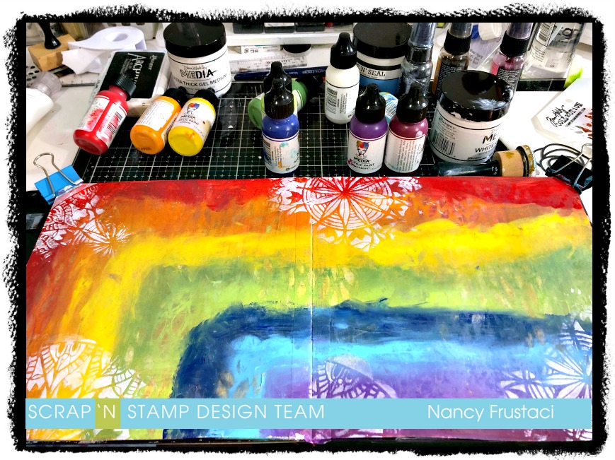
I pulled out a few stencils from my stash, which I have linked to below, and my Tim Holtz blending tool with a clean sponge and got right in there. The first stencil I used was the Spring Medallion from TCW and some white gesso and added this to the corners, top, and bottom of the page. Really just wherever I thought it would look good.
Once I was happy with the first set of stenciling, I rummaged through my stash to pull out things I thought would look good together. I stenciled in some stars and some texture, going in with white gesso, black paint and then the glint paint. Now that I had the stenciling where I wanted it, I watered down some of those same colours and splattered them onto the page. For the white I pulled out my Sharpie paint pen.
I set that aside to dry and then hummed and hawed over what I was going to do next. Rummaging through all my stash, staring at things for a long time, flipping through the collage collective several times, even going as far as ripping something out. I really was in a bit of a funk and was not sure how I was going to complete this page at all.
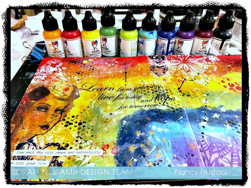
I pulled out some old vellum sentiments I had from my scrapbooking days, as well as some Jane Davenport napkins and decided to collage those onto the background. From there I felt something was still missing so I stamped out some of the hearts from the Collafewd hearts stamp set from Dina Wakley Media. I stamped them onto some collage paper using Archival Black ink and collaged them onto the page as well. I realized quickly that I did not add enough of the gel medium to the back of the collage paper and because of that, you can still see some of the tissue paper. To finish it off I added some sentiment or rather phrases sticker from a Tim Holtz collection.
In the end, I did use the collage collective, I just didn’t use what I had set my sights on at first. I trimmed out this girl and added her to the bottom corner of the second page. Once more adding the same collaged hearts just to tie it in together and adding a little sentiment, which I notice is not straight at all, so yeah not happy about that. Lol
I really hope you got some inspiration and enjoyed the crazy little journey I took you on. Its been a little nutty as of late and the page perfectly expresses my state right now, ie a little all over the place.
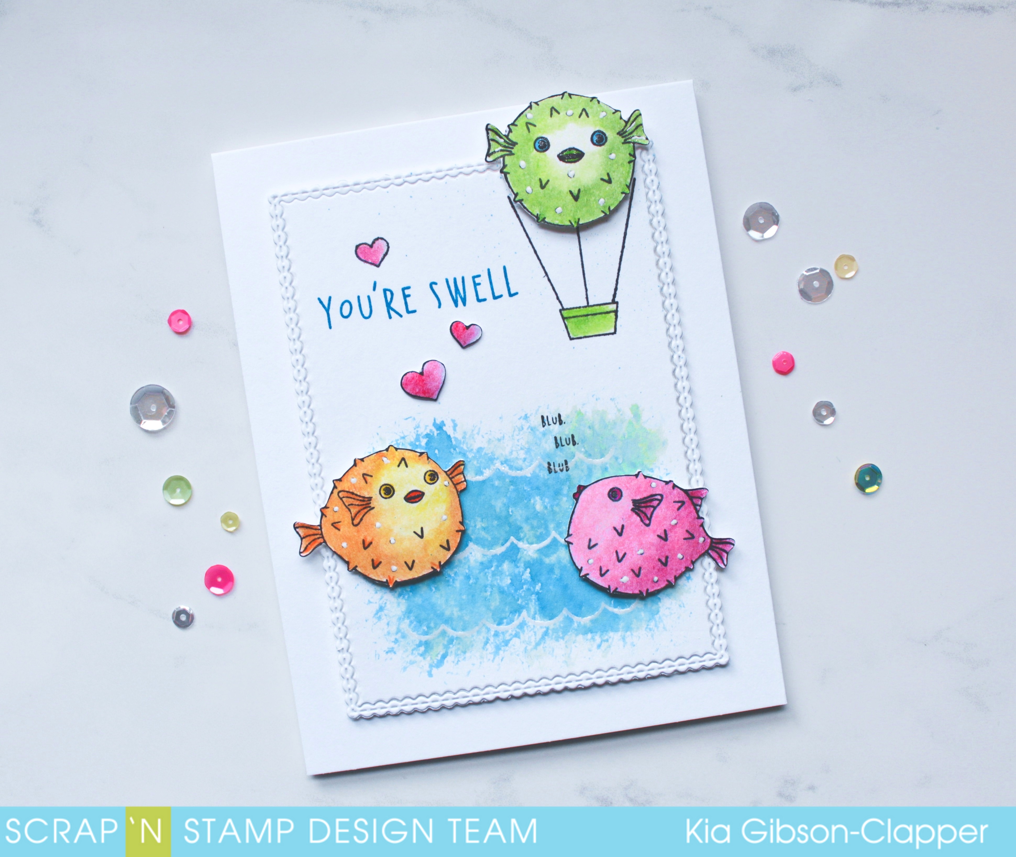
I cannot look at this stamp set and not laugh. How adorable are these puffer’s?
I was going to watercolour, but I thought I would change it up a bit and use my Chameleon Color Tones. I have had them for awhile, yet this is the first time I have used them. I have to say, I enjoyed them very much. They were easy to use and I very much like the colours that are offered. They also come in a great box for storage.
On to my card for today. I am using Hero Arts “I’m A Puffer For You” stamp set.
I first die cut the panel using my Memory Box die, then stamped and heat embossed the waves using Nuvo embossing powder. I mixed up distress oxide inks to colour the water, starting with Salty Ocean, then Cracked Pistachio and finally Broken Glass, drying between each application. I did not want my frame to have colour, so I applied the colour with a rough brush and flicked small amounts of splatter towards to top of the panel representing beads of water falling from the puffer balloon.
I stamped the fish and proceeded to colour with the Chameleon Color Tones, starting with the lightest colour and ending with the lightest colour. What that means is, I start with the lightest colour, go to the medium colour, and once done with that colour I go back over the blending lines with the lighter colour. I go from medium to dark and go back and do the blending area with the medium colour. I colour using small circles as I don’t like to see lines. Needless to say colouring with pencils is time consuming for me, but also very relaxing. Once I am done with my colouring I go over everything with a light covering of Gamsol, or you can use Isopropyl Rubbing Alcohol.
I attached the panel to my card base using foam tape and arranged placement of the fish. I styled each of them and propped them up on foam dots, adding Wink of Stella to the gills, fin, lips and eyes, and white gel pen on each of the fish covering the black circles. I added the hearts with glue, stamped the sentiment using Manganese Blue and the “Blub” sentiment using Jet Black ink.
Scrap’n Stamp has $10.00 off the Chameleon Color Tones for the next week, so now is a good time to add them to your craft supplies.
I hope you have enjoyed this card today and thank you for visiting the Scrap’N Stamp Blog. I have a close up of my card on my blog which you can find here.