Scratch-N-Stamp
Search

Checkout

Keep up with Sales, New Products and other events at Scrap `n Stamp. Sign up for our newsletter now!

What's New

Hot Deals


Search Results for: Tuesday with tara 333

Tuesday with Tara {take 256} Mug of Sunshine

Happy Tuesday!  Today I’m bringing you a big ol’ Mug of Sunshine, combining images & words from ‘Hello Sunshine Turnabout‘ by Concord & 9th with ‘I Like Big Ones‘ by Picket Fence Studios and a fab oldie, the ‘Rays‘ stencil by Tim Holtz.

For the card background, I inked the Rays with two shades of Distress Oxide ink, Fossilized Amber & Spiced Marmalade.  I blended them with a broad Life Changing Blender Brush.  I like to work from light to dark, so went from the outer edges of the stencil towards the center.  I heat embossed the ‘Big One’ mug in Letter It Navy Embossing Powder on deep yellow card stock, then blended some ink onto it for some shading.  I stamped the sunshine design in the same Marmalade ink over the image, then added the sentiment in navy ink over them.

I finished off the card base with some crinkle ribbon wrapped around a blue textured panel.  I added a few sequins for a bit of extra shimmer- these are from the Ocean Breeze set by Picket Fence Studios.

I hope my card brings some SUNSHINE to your day!  I know a lot of BC is getting a ton of rain right now… if I could, I’d gladly share some of my heat & southern sunshine with you!

Inky hugs,

Tara

Tuesday with Tara {take 256} Mug of Sunshine Read More »

Tuesday with Tara {take 244} Kraft Evolution

Happy Tuesday!   Today I’m sharing some cards for Day 21 of our “Random Acts of CARDNESS” Challenge which is KRAFT.  To be fair, it’s kinda  default of mine (I think the last 4 cards I’ve shared have included kraft card stock), but I’m sure for some of y’all it’s a challenge!  Today I doubled the challenge for myself and used the Evolution stamp set by Tim Holtz, which isn’t my typical style.  This set includes two large collage style masculine images that turned out to be pretty easy to work with!

I’ve been in the process of moving my studio space and while I have a work space moved to one room most of my supplies are still in another… I decided to make this project easier on my self and use some pre-inked backgrounds I found while I was making the move. This first card features a fun multi colored background done with Distress Oxide Inks.  I simply stamped over it in black and did a bit  more blending around the edges with Black Soot Distress Oxide Ink.  I chose to use the deepest shade in the background, purple, as a layer behind my image to mount on a 5.5″ square Kraft card base.  I stamped a text stamp by Finnabair along the edge of the card in black as well.  I deliberately stamped crooked to mimic the text in the main image.

I wasn’t really sure where to go from there…so I set the card aside for a bit and started on the next one, which is similarly stamped on an inked tag.  Once I had both images attached to base cards I added some ribbon, which I adhered with my tiny attacher- Tim’s little staple tool.  I wanted some extra stability on my ribbon so I could hang a large metal embellishment (one of Tim’s adornments from my stash).  I then remembered some little brads that were a perfect fit- a hat for this card and a mustache for the other.  A chit chat sticker didn’t seem to be enough on it’s own, so I layered it over washi tape and added a couple more staples.  Once I finished everything I added a touch of extra texture with clear paste through Tim’s CARGO font stencil.  Once everything was dry, I smeared a bit of Distress Oxide Ink with my fingers over the stenciled letters to help them stand out a bit.

This second card is on a 5×7 Kraft base which I had previously sprayed with some Distress Oxide Spray.  Since my tag was inked in greens, I tied it together with the background by inking my edges with Salty Ocean Distress Oxide Ink.   My image is a bit splotchy here because I’d stamped it on a background that was still wet, but I decided I still liked the look and I’d just go with it!

All in all, I’m pretty pleased with how these came out.  It’s great to have some masculine cards ready to go and these images are perfect for that!  I hope you like them too- and I can’t wait to see what you share with our Facebook group featuring kraft today!

Inky hugs,

Tara

Tuesday with Tara {take 244} Kraft Evolution Read More »

Tuesday with Tara {take 211}

Happy Tuesday!

As promised, I’m wrapping up July with one more Christmas in July card- this one combines our Blog Hop ‘Turnabout’ theme for July (and featured stamp company, Concord & 9th) with the Christmas theme! I’m using the Snowflakes Turnabout as my card background, behind a little die cut scene I created with a Distress Oxide blended background and dies by Poppy Stamps (Tree Line Hill) & Memory Box (Whispering Pine Landscape) I got them last year and hated that I only only made a couple cards with them! They are no longer in the online store, but I found another similar one that you could use (and I think I need to get to use along with them)!

I created my scene in multiple layers- blending my background with Iced Spruce & Peacock Feathers Distress Oxide inks & a Life Changing Blender Brush. I die cut the trees from book print, green cardstock and a pearly white cardstock, then layered them over my background and die cut the whole thing with a Lawn Fawn Small Dotted Square Stackables. (I’ll be purchasing the large set so I can have a dotted layer to use together with these! For today, I simply cut a layer 1/4″ larger than the 4″ square). I combined a die cut word (Shadow Script Christmas) with seasonal sentiment stickers by Tim Holtz and finished off the die cut panel with some thin jute. I added some Nuvo Glitter drops to the die cut ‘bright’ and some Rock Candy Distress Stickles (pretty sure it’s discontinued.. but I have a stock pile. The dry glitter is still available, I believe) to the trees for a bit of shimmer.

I stamped my turnabout in the colors I used in my background and added in Mowed Lawn to tie the green in. Turnabouts are designed to be stamped four times, and I used only three colors… the fourth was actually stamped twice with the Spruce & Peacock (I was considering just doing it in one color and changed my mind) so it created a mid tone similar to the blend between the two in my background 🙂 I finished off my snowy background by splattering some Distress Spray Stain in Picket Fence over it.

I was a bit late to the game starting on Christmas in July, but if I’d had time to keep going I would have… ideas were starting to flow and I was ready to shop for some new stamps, stencils & dies! Hopefully my creation inspires you likewise 🙂

Inky hugs,

Tara

Tuesday with Tara {take 211} Read More »

Tuesday with Tara {take 109}

Happy Tuesday!

Guess what arrived after last week’s blog hop post went live?  My package that included the freebie stocking die, which I hope many of you will have arriving soon at your homes after you did some retail therapy in the online store 🙂  So, as promised, I’m sharing one final “Christmas in July” creation… on the first of August 🙂

I decided to go with a tag… which would be fabulous hanging on a gift bag or bottle of wine as a gift, or it may end up the focal point of a card later on!  I die cut the gorgeous stocking die twice, once out of kraft and once out of the silver glitter cardstock.  I taped up the back of the glitter die cut to keep all those detailed pieces from going anywhere, then layered the kraft die cut over it.  I love the contrast of the neutral kraft over that glittery base!

I inked up a manila tag with a variety of green & blue Distress Oxide Inks, then added a bit more shading a stamped sentiment in Vintage Photo Distress Oxide.  A few brown toned sequins worked well to mix with both the kraft & the glitter elements.

I pulled some pre-inked pieces of crinkle ribbon from my stash that coordinated nicely with my tag and added a little piece of Christmas idea-ology by Tim Holtz to finish it off!  All in all, it’s a pretty simple project, but something as detailed as this stocking die doesn’t need much to look complete!  Plus, I think I managed to make something completely different than everyone else who did the hop, which can sometimes be a challenge after you’ve seen their amazing inspiration pieces!  If you missed the hop, check it out HERE.


Thanks for stopping by!

Inky hugs,

Tara


Supplies I’ve used:

Dee’s Distinctively Stocking Die

Silver Glitter Paper

In the Making Retro Merry Christmas stamp (love that the words are separate so I can rearrange them!)

Distress Oxide Inks (a variety from set 1)

Manila Tag #8

Crinkle Ribbon (inked with assorted Distress Inks)

Christmas charm by Tim Holtz idea-ology


Tuesday with Tara {take 109} Read More »

Tuesday with Tara {take 89}

Happy Tuesday!

IMG_9329

This week I want to share with you my excitement about the new Distress Oxide inks by Ranger & Tim Holtz… it’s so fun when something completely new & different comes out on the market because it can really add new life to all the supplies you own already!  I brought home six of the new inks and most of my inky play you see here was with just two of them, peeled paint & faded jeans.  So hopefully this little sampling shows you that you can still have some fun with new supplies even if your budget is small (or you can go big and buy them all… don’t let me stop you!  Lol)

IMG_9331

If you’ve been following me for a while, you probably have noticed that I LOVE working with/on kraft cardstock.  I was most excited to get my hands on Distress Oxides because of their unique properties as a hybrid ink which allow me to not just stamp but do background and blending techniques that will show up on kraft & black!  I love this!  Here is some simple  ink blending on kraft- I inked directly on the tag with a blending tool as well as rubbed the ink onto my kraft sheet, spritzed with water and pressed & dabbed the tag into the inky puddles.  Look at the gorgeous variety of shades I got from just two inks!  Love it!  And check out the funky oxidation look from mixing these inks with water.  Yum!

IMG_9332

Here’s another tag that I stenciled onto, layering and misting my inks:

IMG_9333

Again, this was on a kraft tag base!  I also did a bit of ink blending and stenciled on a black tag:

IMG_9330

The black tag didn’t accept water as well as the kraft or a regular Manila tag, but the inks look amazing stenciled on it!

Heres another look at the two kraft tags… and I’ll show you the completed black tag in a week or two!

IMG_9337


other supplies:

tags, kraft & black

Dylusions modern script stencil

Tim Holtz scribbles stencil

Non stick craft sheet (my favorite work surface- especially with Distress Ink products!)

ink blending tool

Tim Holtz handwritten thoughts stamp


inky hugs,

Tara


Tuesday with Tara {take 89} Read More »

Tuesday with Tara {take 87}

Happy Tuesday!
I apologize in advance if extra bits of spring goodness are peeking through on my projects, especially if it’s feeling like you are in the middle of a never-ending winter!
IMG_9265

The background of this card is a bold abstract I created using Color Burst and a stencil.  If it looks familiar, it’s because I made a variety in one sitting and have been creating cards with the pieces as inspiration strikes!  Any stencil with a bold, open design would work great for the “sprinkle & spritz” technique I’ve used.

Here’s a close up of the white embossed sentiment and some of the cute little die cut birds…
IMG_9266

These little birds are such a fun addition to a card!  I feel like I need to invest in more birds to go with this sentiment… these are by Memory Box, and while they aren’t in stock I’m sure Raya could help you buy something similar 😉

if you love a good discount (don’t we all!?!)  check out the current specials on the online store here!  There’s a ton of new stuff arriving these days, I know my wish list is a whole lot bigger than my budget… lol, I hope you don’t suffer from the same affliction!

inky hugs,

Tara

Tuesday with Tara {take 87} Read More »

Let’s get (Di)stressed Blog Hop

EXPLORE DISTRESS OXIDE INKS WITH US!

Welcome to the Scrap ‘N Stamp October Blog Hop! We are thrilled to have you join us as we (Di)stress a bit this month… by having some inky fun with Distress Oxide Inks & Sprays! The Design Team has some gorgeous projects ready to inspire you AND this weekend you can save 10% on all things OXIDE (even the new sprays!) with coupon code “OXIDE10” (fine print: not valid with any other coupon, sale or promotion. Valid on in stock items only. Expires Oct. 6 at midnight)

Win Prizes

As you know, we love when you leave us some love by way of comments… so will once again be randomly selecting a commentor to win a $50 gift certificate to the SNS online store! (winner will be announced Oct 22) Be sure to comment at all the stops along the way- the full link up is at the end of this blog post!

Be Inspired

It’s my privilege to kick things off once again with my project! I use Distress Oxide Ink probably on about 80% of my cards these days. But the funny thing is, I was a bit stumped with what to share! Thankfully, I found some time to ink up something autumn inspired. I also got to use the die cut letters that were left from the project I shared on Tuesday– bonus!

My card features a resist technique on book print paper, which I’d never tried with Distress Oxide Inks before. It was a bit touchy adding water to such thin paper, but it was fun to see it all come together! I started by clear embossing leaves from the Sketchy Flowers stamp set by MFT. I then added my first layer of ink with my Life Changing Blender Brushes by Picket Fence Studios.

(Di)stress with Distress Oxide

One of my favorite things about Distress Oxide Inks is how the colors layer over each other, especially when you add water to help them oxidize! I brushed on another layer of color, then rubbed and misted some Spiced Marmalade onto my kraft sheet and dabbed it over the surface. I used a slightly damp rag to wipe the ink off the embossed design, revealing the white leaves. It felt like it needed just a bit more colour, so I used the coordinating solid images to help my design stand out.

My card base was made from a scrap of brown cardstock, sized approximately 7″ square before I scored it. I heat embossed one of the leaves on a lighter brown cardstock in metallic teal and copper. I love the look of two-tone embossing, though it’s been a long time since I’ve done it! Details like twine, bling and some splatters of Distress Oxide Spray in Spiced Marmalade and Distress Spray Stain in Antiqued Bronze finish off my card.

I really love how the Old Paper Distress Oxide ink plays so well with the alcohol ink colors in my letters! It also really softens up the brightness of the other colors.

I hope you like my card, and I know you’re gonna love the rest of the projects in this Blog Hop! Next up you are heading over to see what Kia has for you! Below you’ll find the full list of links for the team.

Hop Along


Happy Hopping!

Inky hugs,

Tara

Let’s get (Di)stressed Blog Hop Read More »

Floral Frenzy Blog Hop

Yay! It’s blog hop day and since it’s MAY we’re celebrating all things FLORAL today with our Floral Frenzy blog hop! You’re at the very beginning and you are in for a treat- TEN stops in total with our full team sharing projects as well as a guest designer, former DT member Jessica!

As always, we value the comments you leave at all the blog stops along the way… and your comments give you a chance to win! This month we are giving away one BIG prize of a $50 gift certificate! If you’re not sure what to comment along the way, let us know your favorite kind of flower 🙂

Today I decided to make a card for my Mom, since Mother’s Day is coming up! I’ve used the ‘Good Idea’ stamp set by Dina Wakely, because as it says on one of the stamps in the set- flowers are always a good idea!

I wanted to use a color combo that would really pop with the kraft background I chose, and I think this combo of blue & green with purple flowers really does! I’ve stamped a Cover-A-Card Script stamp by Impression Obsession in brown on the kraft background to add a bit of visual texture.

The inside & out stitched circles were die cut from the front of a 5.5″ square kraft card (I used the cut out circles on the card I shared on Tuesday!). I used shades of green & blue Distress Oxide on a white square of cardstock the same size and added water & layers until I got a fun blended, textured look. The flowers were stamped once on the inked background, for placement, and again on white. I used regular Distress Ink to color them because it is less opaque and didn’t hide the black lines as much as Distress Oxide would. I did end up going over some of the lines with a black Stablio pencil afterwards to make it pop, but overall it gave me a nice color blend. I used my tiny/ fine Life Changing Blender Brush to color the flower centers yellow, then added some tiny beeds to my flower centers as well.

I decided to cut ‘MOM’ in negative space on the card front as well, so used 1″ Alphanumeric dies for that. I simply used a scrap of washi tape to keep them in place while I ran it through my Big Shot. This was done before adhering all the pieces together 🙂 Assorted colors & sizes of purple bling add some interest to the finished card. I hope you like it!

Here’s the full list of links for the Floral Frenzy Blog Hop- I’m sure you will love the creative project these talented ladies have for you today! Your next stop is the talented DAWN, so hop on over and have some fun!

1 (YOU ARE HERE) Tara
2 Dawn
3 Susan
4 Nancy F
5 Deborah
6 Kia
7 Laurie
8 Chala
9 Nancy
10 Jessica

Happy Hopping!

Inky hugs,

Tara

Floral Frenzy Blog Hop Read More »

Background Check Blog Hop

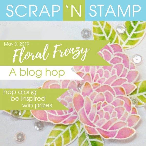
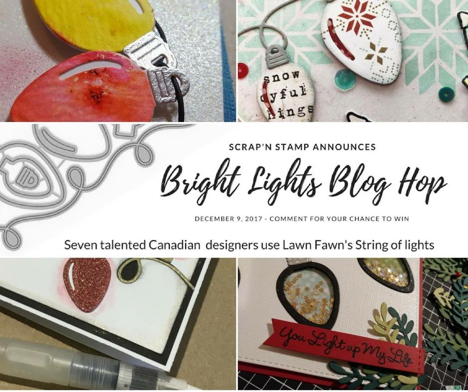
Welcome to the Scrap ‘N Stamp April Blog Hop!  We are so glad you are here with us today to get some inspiration on a fun variety of ways to create backgrounds using the Life Changing Blender Brushes that are new in the SNS online store!

Here’s the full hop order!  You’re at the beginning with me (Tara) and my card!  If you get lost anywhere along the way, just pop back here for the next link 🙂  Don’t forget to leave comments along the way for a chance to win fabulous prizes… we are giving away 8 Background prize packs and one $50 gift certificate to random commenters along the way! BONUS: You can have 20% OFF the brushes this weekend using the coupon code BRUSH20 (ends Sunday!)

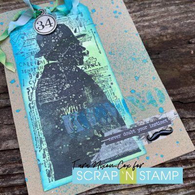
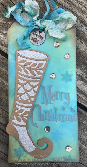
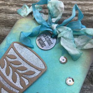
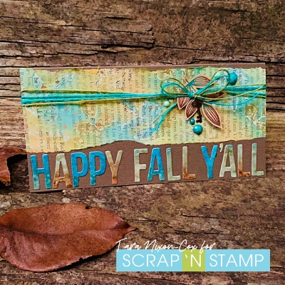
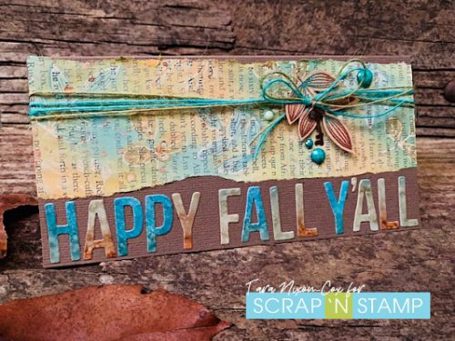
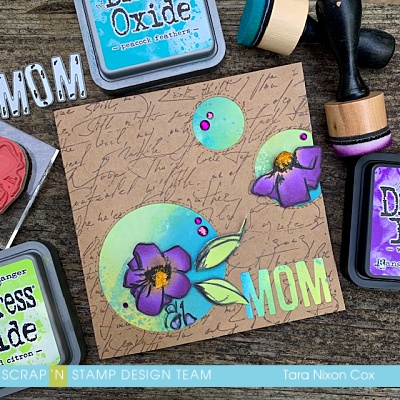
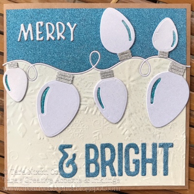
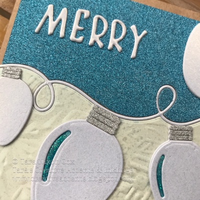
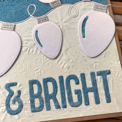
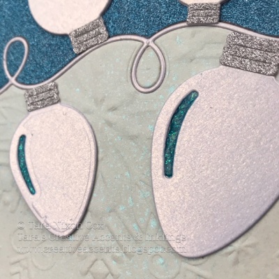
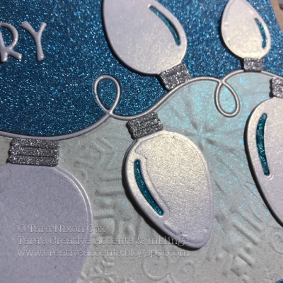
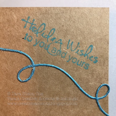
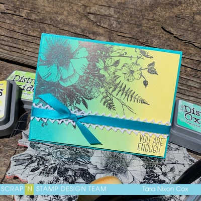
I made two similar cards for today’s hop- here’s a look at them together:

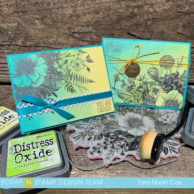
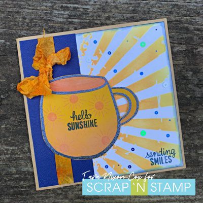
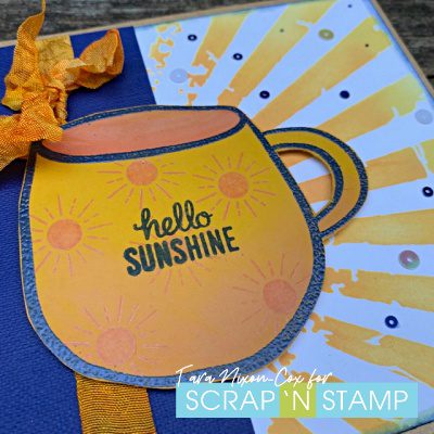
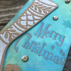
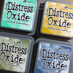
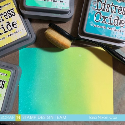
For these cards I wanted to feature a simple ombre type background to let this HUGE stamp shine- it’s Glorious Garden by Tim Holtz and it comes with four simple sentiments and a grid block big enough for the design (I was super excited to see that, though I used it with my stamp platform).  I am brand new to these brushes and a pretty die hard fan of the Ranger Blending tools, but I found these easy to work with and create smooth ‘line free’ blends with my Distress Oxide Inks (for both cards I used Squeezed Lemonade, Twisted Citron, Cracked Pistachio and Peacock Feathers).  They were also really easy on the hands, which I’ve heard from a lot of people who struggle with gripping tools.  There are several smaller set options if you aren’t ready for the full set of brushes (or don’t have the budget- I totally get it!).  I think the 2 pack sampler would be a great start!

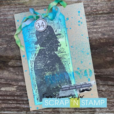
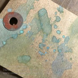
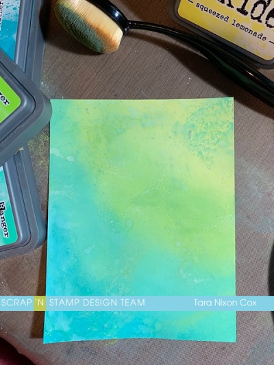
My ‘before’ photo of my first card is actually the graphic for the hop, but here it is again so you can check out those smooth blends… I only misted a tiny bit of water to add a bit of oxidization.

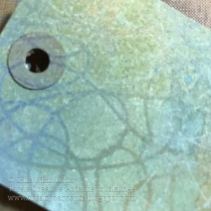
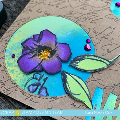
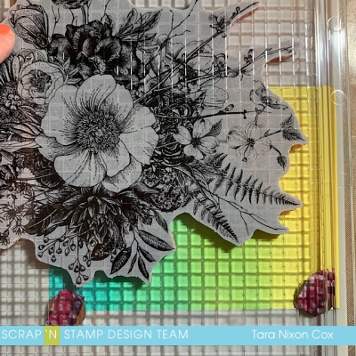
Here is what the stamp placement looked like in my stamp platform.  I used Versafine Clair and stamped twice to make sure my impression was perfect.

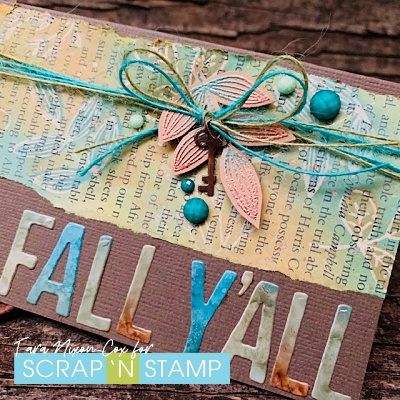
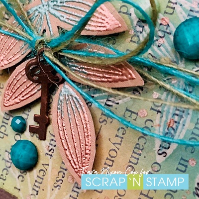
I wanted to keep these cards really simple, so just added a bit of ribbon with some lace behind it.  When adding ribbon to a top layer like this, I have a little trick I use to keep the knot (or bow) in exactly the right spot.  First, I cut the ribbon so it’s plenty long (at least 3-4 times the width of the layer, ) and tie the knot/bow in a loop, like this:

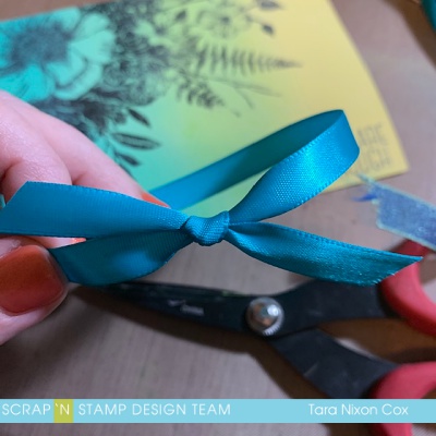
Then I find my perfect spot and snip the ribbon so it has overhang on both sides, which I will adhere to the back of my card.

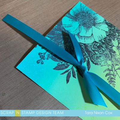
The amount of overlap doesn’t really matter, as long as there is enough to tape securely (it may be 1/2″ on one side and 3″ on the other… nobody will know!)  Here’s another look at that card:

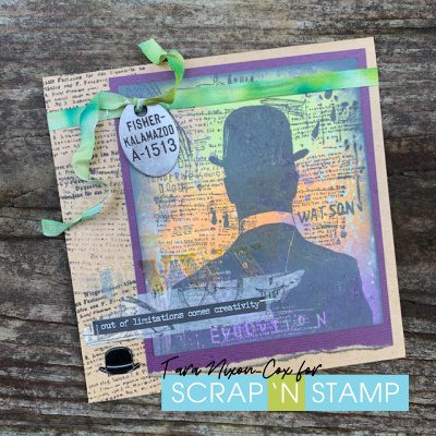
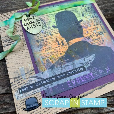
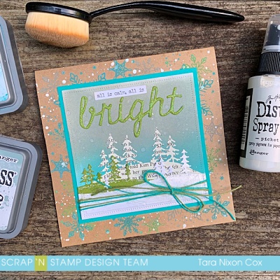
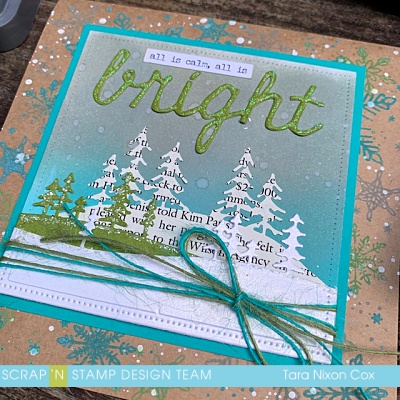
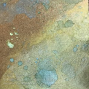
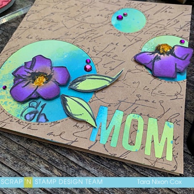
For my second card, I did a diagonal ombre and added a bit more oxidization with some wet, inky layers on my craft sheet.  I wanted the yellow to be in the big blossom this time, with the design coming up from the bottom right corner.  Here’s a peek at my background before I stamped on it.. love that subtle oxidization!

And here’s the finished card!

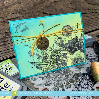
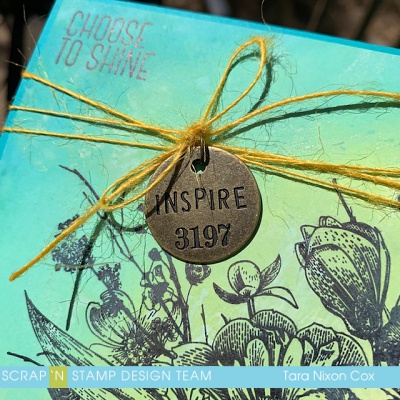
I went for yellow twine and a Tim Holtz charm to finish it off:

The cards are very simple, but the fabulous backgrounds and that gorgeous floral stamp really shine.  I hope you like them!  I’ll have a similar card design on a very different background to share with you on Tuesday, so please check back!  If you are ready to try your hand at creating fabulous, inky backgrounds, please join us on our Challenge Page!  We’d love to see what you create (and you’ll get another chance to win a gift certificate!).


Hop on over to see what Nancy E. has created next!

Have fun hopping!

Inky hugs,

Tara

Background Check Blog Hop Read More »

Bright Lights Blog Hop

Welcome to our Bright Lights Blog Hop!  Today the team is excited to be sharing with you some projects featuring the string of lights die by Lawn Fawn!  Be sure to leave comments at each stop along the way… there are chances to WIN prizes, this time they’ll be from the next Lawn Fawn release on Dec. 14!  You’ve got until Friday, Dec. 15 to comment, winners will be announced next Saturday 🙂

This die set is a lot of fun and comes with a bunch of pieces, including two layers each for three different sizes of light bulbs!  I decided to use all of them on my card and cut them from a pearly white card stock.  The set also includes two different styles of toppers for the bulbs, I saved myself a step die cutting by trimming the ‘hanger’ part off of half of them.

I love the curly ‘string’ that’s part of this die set and did an inset die cut, cutting it from both of my background papers and piecing it between the two for a smooth background.  Adhering Be Creative Tape on the back of my papers before die cutting helped make it seamless!  I used the ‘merry’ word from the new Tim Holtz ‘Merry Christmas’ die, and cut ‘& bright’ out from Tim Holtz’s 1″ Alphanumeric Die Set.

My white snowflake background is the same as you saw here.  It’s hard to capture the shimmer, but here’s a couple more shots, in natural light and with a flash 🙂

I added the blue glitter string to the inside and a sentiment stamped in the corner to finish my card… hope you like it!

I think you’ll really be inspired by the different things everyone has created today!  Have fun along the hop 🙂  If you get lost along the way just check back here to find your next stop!

Have FUN on our Bright Lights Blog Hop!  And have fun shopping too…

Inky hugs,

Tara


Materials Used:

Bright Lights Blog Hop Read More »

Free Shipping Anywhere In Canada